Architecture Studio Rebrand - Dubai | Switzerland
Samuel Creations now SC Design+ is a Swiss-based architecture and interior design firm with forty years of heritage in rendering and realising spaces for corporate and hospitality clients. Four decades of accumulated expertise, an international reputation built project by project, and a studio expanding its reach beyond its established European base. What the firm did not have was a brand identity equal to its ambitions. Mike Rock Studio was commissioned to rebrand the studio completely — delivering a new identity, a custom typeface, an iconography system, and comprehensive guidelines for a design firm preparing to compete at the highest international level.
The Challenge
Designing for a designer is the most demanding brief there is. A studio with forty years of experience rendering architectural and interior spaces for some of the world's most discerning corporate and hospitality clients will evaluate every typographic decision, every proportion, every spacing choice with the same critical eye they apply to their own work. There is no room for the kind of creative shortcuts that might pass unnoticed in other sectors. Every element of the identity had to be resolved to the standard of a firm that has spent four decades thinking about the built environment in precise, considered detail.
The international expansion imperative added a specific strategic challenge. SC Design+ needed a brand that could walk into a conversation with a Zürich developer, a Dubai hospitality group, or a London corporate client and be immediately recognised as the work of a serious, established studio — without requiring the forty-year backstory to be told every time. The identity needed to carry that heritage visibly, in the quality of its execution rather than in explicit statements about longevity.
The rebrand from Samuel Creations to SC Design+ was itself a significant step, a name evolution that signalled a more expansive, internationally oriented practice while preserving the initials that connect the new identity to the reputation the studio had already built.
The Approach
The strategic foundation was precision - the quality that defines both Swiss design culture and the practice of architecture itself. Switzerland has a specific and extraordinary relationship with typographic and visual design: the International Typographic Style, the grid, the systematic organisation of visual information into something that is simultaneously functional and beautiful. For a Swiss studio expanding internationally, that heritage was not a constraint but an asset, one that needed to be honoured in the execution of the identity without being made explicit as a reference.
The custom typeface was the most significant creative decision of the project. A bespoke typeface designed specifically for SC Design+ does something that no licensed font can: it gives the studio a typographic voice that is entirely its own, unreplicable by competitors and immediately recognisable as the expression of a specific creative intelligence. For a design firm, the typeface is also a demonstration of capability, a signal to clients that the studio's understanding of form, proportion, and visual language extends to the most fundamental level of graphic communication.
The iconography system extended that precision across the functional communications of the studio, a cohesive set of marks developed to work consistently across architecture, interior design, and the rendering specialisms that have defined SC Design+ for four decades. The guidelines were built to support an internationally distributed studio: comprehensive enough that the identity applies with the same quality across Zürich, Dubai, or any market the expansion takes the studio into.
The Work
Brand Identity:
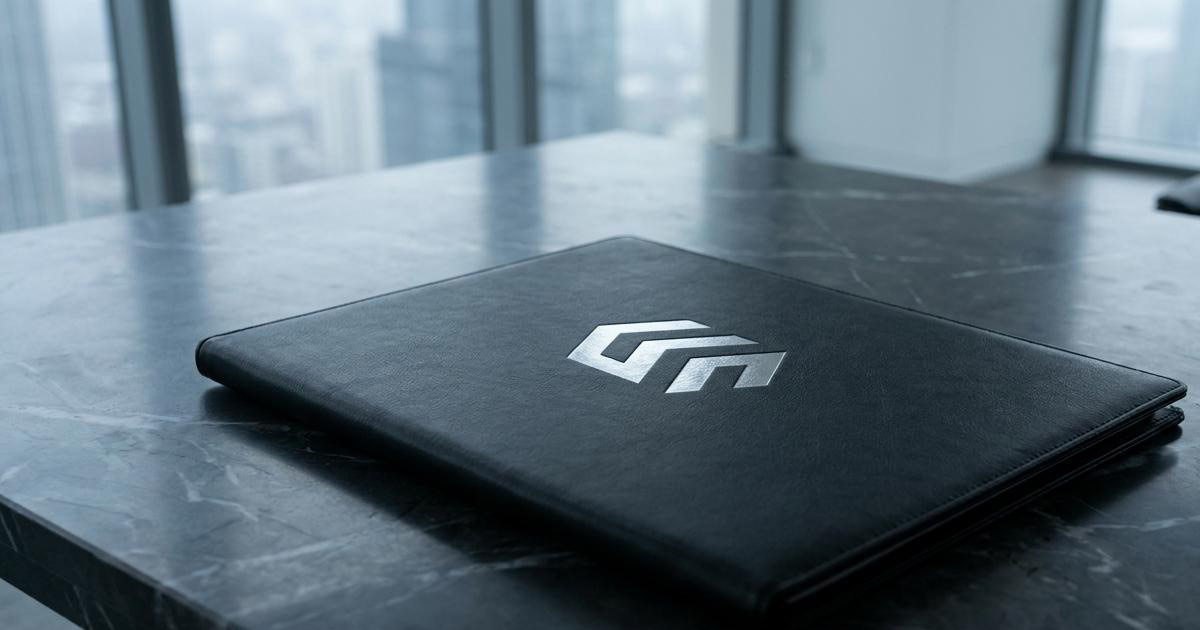
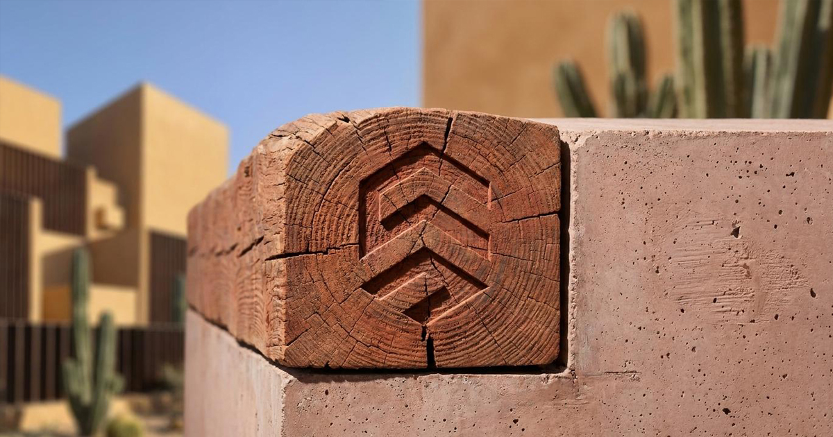
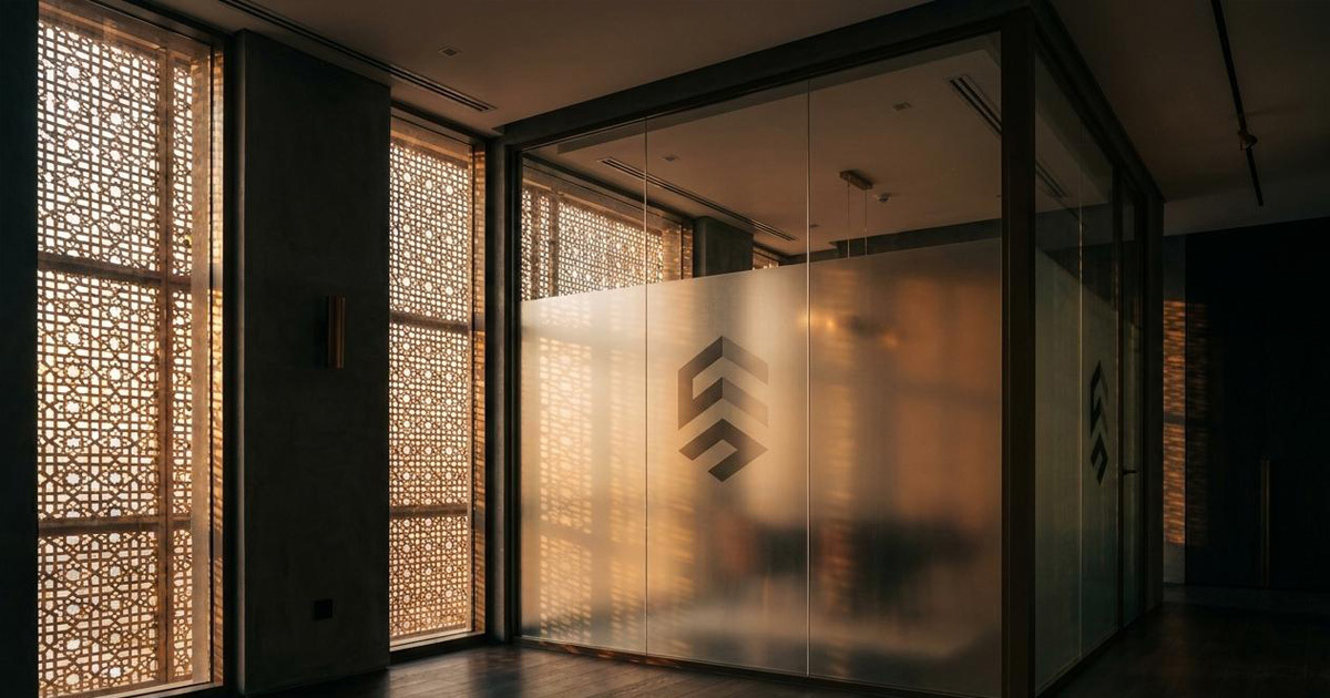
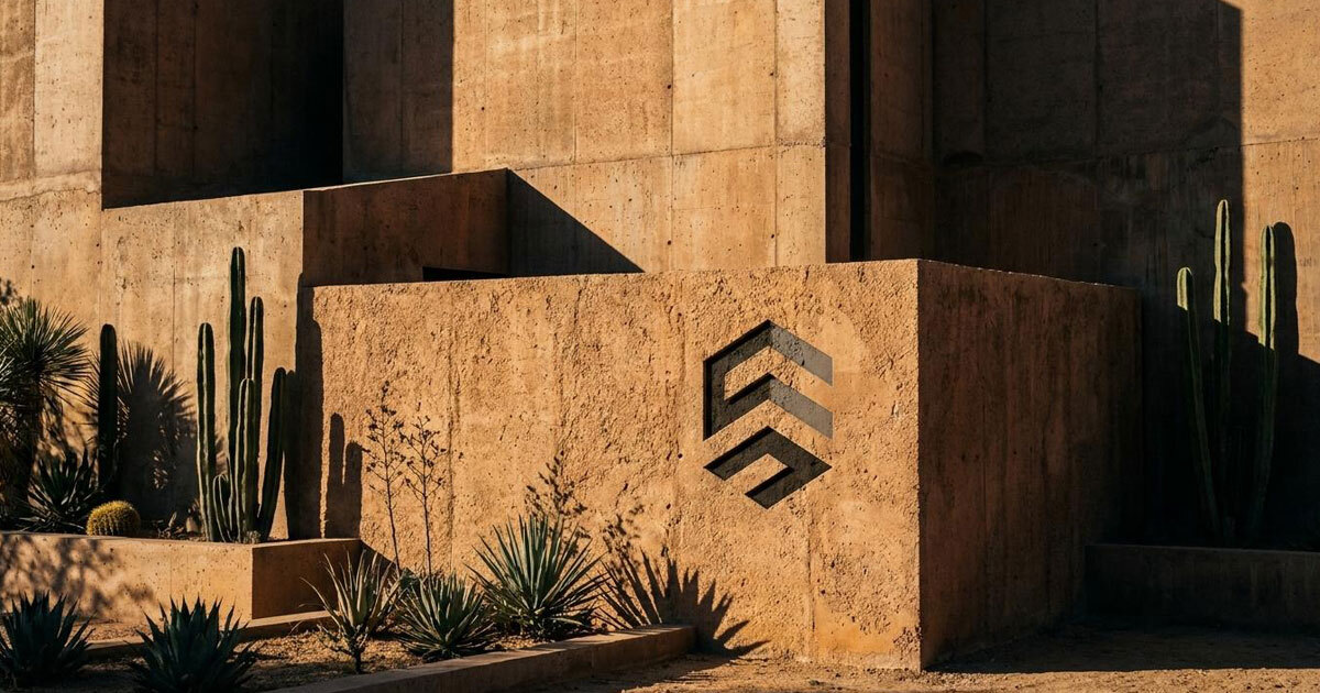
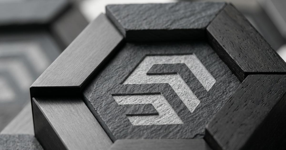
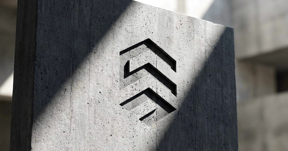
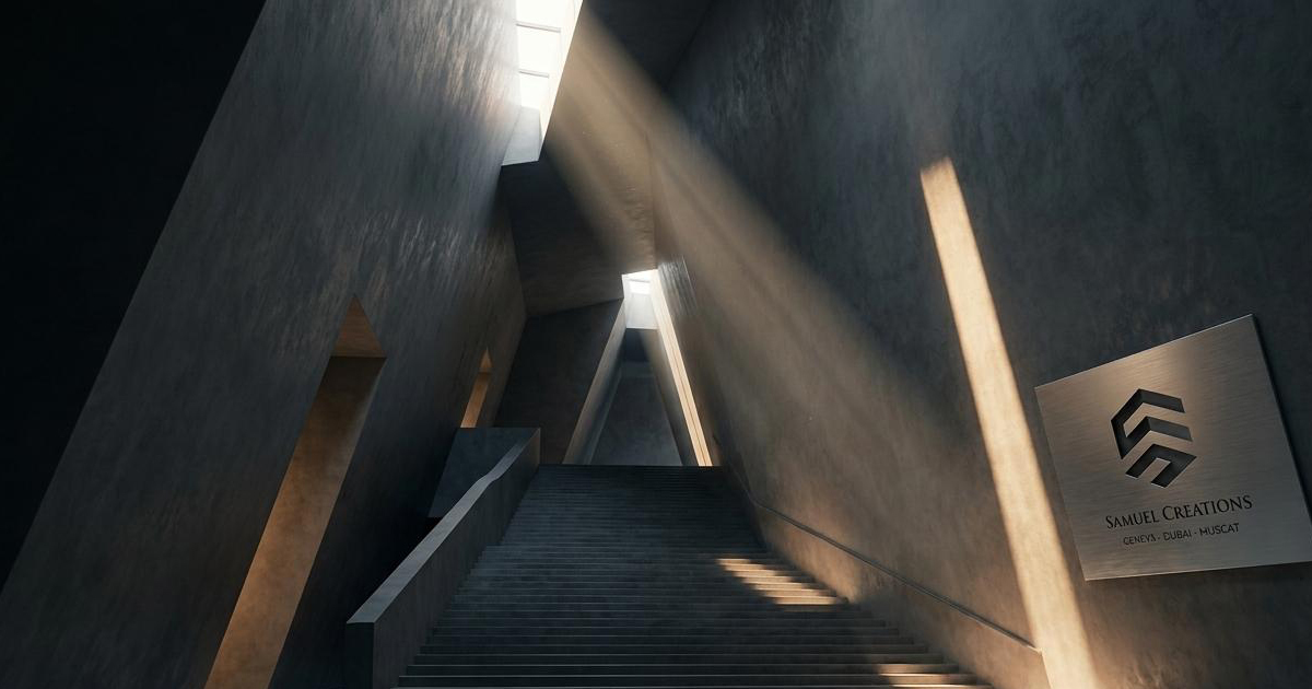
A complete visual identity for SC Design+ refined logomark, colour system, and the visual language of a forty-year Swiss design studio prepared for international competition. Every proportion considered, every detail resolved.
Custom Typeface Design:
A bespoke typeface designed exclusively for SC Design+ giving the studio a typographic voice that is entirely its own. The most technically demanding deliverable of the project and the most distinctive asset of the rebrand.
Iconography System:
A cohesive set of icons developed to work consistently across SC Design+'s architecture, interior design, and rendering communications, precise, functional, and built on the same visual logic as the identity.
Brand Guidelines:
A comprehensive guidelines document covering every application of the SC Design+ identity developed for a studio operating across multiple international markets and requiring the same standard of execution at every point of contact.
The Outcome:
SC Design+ enters its next chapter with a brand identity that reflects the quality and precision of the studio it represents — and a custom typeface that no competitor can replicate. The rebrand positions the studio credibly for the international corporate and hospitality briefs it is pursuing, carrying forty years of earned expertise in a visual language that communicates it without needing to explain it.
Designing for a designer requires that every decision be right. These were.
Project Details:
Services: Brand Identity · Custom Typeface Design · Iconography · Brand Guidelines
Industry: Architecture · Interior Design · Design Studio
Location: Switzerland
Market: International Corporate · Global Hospitality · European Architecture