Asset Management Brand Identity UK
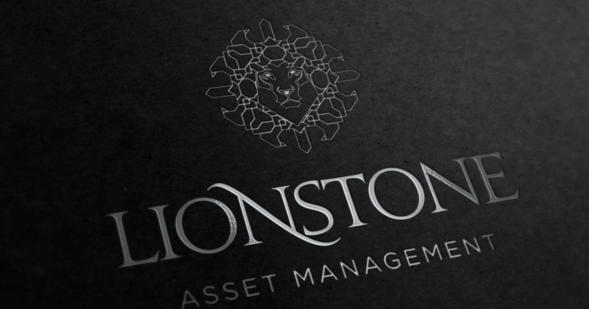
Lionstone Asset Management is a privately owned UK asset management firm specialising in the conceptualisation, research, and execution of national investment strategies on behalf of institutional investors and high net worth individuals. The brief was to build a complete brand identity from scratch: one that communicated the precision of the firm's investment methodology, the authority of its institutional positioning, and the heraldic confidence of a name that combined two of the most resonant symbols in British financial culture: the lion and the stone. Mike Rock Studio delivered the full brand — identity, guidelines, and collateral for a firm that needed to arrive in the asset management market with the presence of an established house.

The Challenge
The UK asset management sector is among the most visually conservative in financial services. Established firms carry their credibility through decades of track record and the accumulated weight of institutional relationships. A new entrant however strong its investment thesis and however experienced its principals, faces the fundamental challenge of communicating, through visual identity alone, the kind of authority that established firms have built over generations.
For Lionstone, the name itself was the most significant creative asset and the most significant creative responsibility. A lion is one of the oldest and most powerful symbols in British heraldry — strength, authority, guardianship. Stone carries permanence, solidity, the endurance of what is built to last. Together they form a name that makes an extraordinary promise: a firm as powerful as a lion, as durable as stone. The identity needed to be worthy of that promise — which meant a mark of genuine ambition, executed with the precision and quality that institutional investors and high net worth clients would expect.
The Approach
The logomark was the most important creative decision of the project — and the most demanding to execute. A geometric lion, composed of crystalline facets arranged into a form that suggests both the leonine head and the structural complexity of a stone formation, achieves something rare in financial services identity: it is simultaneously heraldic and contemporary, powerful and precise. The faceted construction references the firm's investment methodology the rigorous, multi-dimensional analysis that goes into each strategy while the lion at its centre carries the authority and guardianship that Lionstone's clients expect of the firm managing their capital.

The typographic wordmark - LIONSTONE, set in a refined serif with considered letterform detail carries the same dual register. Classical enough to communicate the heritage associations of a name built on lion and stone; precise enough to signal a contemporary, analytically rigorous investment firm. The combination of mark and wordmark, rendered in silver against deep black, communicates the specific quality of luxury that the institutional and high net worth asset management market responds to: understated, authoritative, and built to endure.
The guidelines and collateral were developed to carry that visual intelligence into every client interaction — from the first meeting to the documentation supporting an investment mandate.

The Work
Brand Identity:
A complete visual identity for Lionstone Asset Management, the geometric crystalline lion logomark, refined serif wordmark, silver and black colour system, and the visual language of a UK asset management firm built for institutional investors and high net worth individuals.

Brand Guidelines:
A comprehensive guidelines document covering every application of the Lionstone identity ensuring consistency and quality across investor communications, corporate materials, and digital presence as the firm grows.

Corporate Collateral:
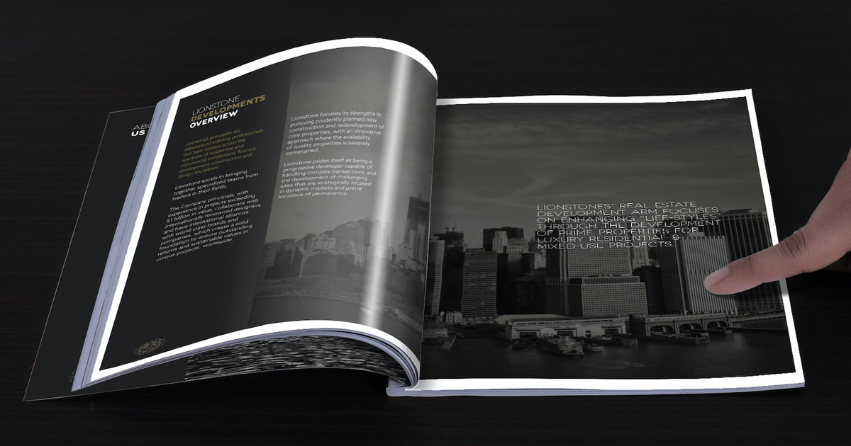
A suite of corporate materials developed for the full range of Lionstone's client interactions: stationery, presentation materials, and branded documentation built to the standard of a firm managing significant institutional capital.

The Outcome:
Lionstone Asset Management launched with a brand identity that arrived in the UK asset management market with the presence and authority of a firm that had been operating for decades. The crystalline lion mark is among the most considered and ambitious logomarks in the Mike Rock Studio portfolio, a mark that rewards scrutiny, communicates the complexity of the investment methodology it represents, and carries the heraldic weight of a name built on two of the most powerful symbols in British financial culture.
A firm named for a lion and a stone deserves a brand built to outlast both.

Project Details:
Services: Brand Identity · Logomark · Brand Guidelines · Corporate Collateral
Industry: Asset Management · Investment · Financial Services
Location: United Kingdom
Market: UK Institutional Investors · High Net Worth · Asset Management