Contemporary Jewellery Brand Identity

Jodor is a contemporary jewellery house built for the space almost nobody designs for: between mass-market everyday basics and the predictable prestige of heritage houses like Cartier or Tiffany. For a clientele actively avoiding the uniform both the fast-fashion version and the legacy-brand version, Jodor offers something rarer: high-concept, fun, and fresh pieces that haven't yet saturated the mainstream. Mike Rock Studio positioned Jodor as a discovery brand, the name people find before everyone else does.

The Challenge:
Contemporary jewellery is one of the hardest categories to brand well, because it has to be cool enough to appeal to independent-label enthusiasts while carrying enough visual authority to justify luxury pricing. Independent labels in this space usually struggle with invisibility they don't have the recognition of a heritage house, and without a strong enough visual identity, they get lost between the daily-wear basics and the big three.
The actual consumer problem Jodor solves is specific: it's genuinely difficult to find high-quality, modern jewellery that feels unique rather than either disposable or predictable. The brief was to position Jodor not just as a jewellery brand but as a curator of a specific aesthetic built for an audience that values design-led exclusivity over brand-name recognition, and that wants to feel rewarded for finding something before it's everywhere.
The Approach:
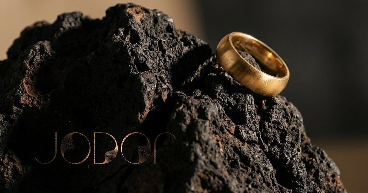
The strategy was built around a single idea: curated rebellion. Jewellery branding defaults almost universally to soft, romantic visual language - close-up sparkle shots, warm lighting, gentle femininity. Jodor deliberately moved away from all of it, toward something closer to a contemporary art gallery or a high-fashion publication.
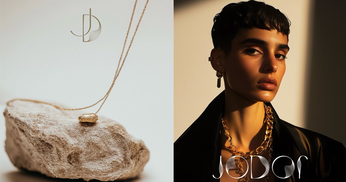
The photography direction is high-contrast and largely no-face, letting the architectural form of each piece take centre stage — metal, skin, and shadow doing the work instead of a model's expression. That choice reframes the product itself: a Jodor piece reads as a design object first, an accessory second. The brand voice followed the same logic, confident, slightly detached, written the way an early adopter actually talks rather than the way a traditional jewellery brand performs warmth.

The Work
Brand Identity:
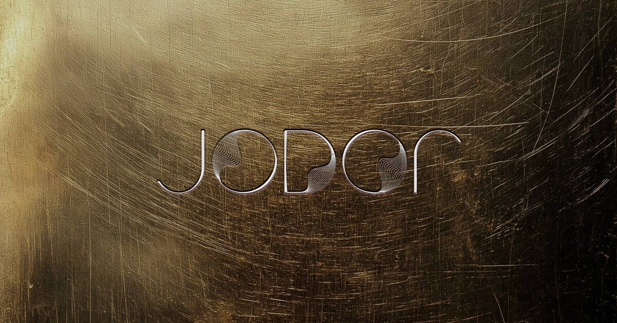
A bold, typography-led identity built around a structured, balanced logomark designed to read as well embossed on a jewellery box as it does as a small digital watermark. Modern, clean, and unmistakably premium without borrowing the visual language of legacy houses.
Brand Positioning & Strategy:
A defined position for Jodor between the legacy houses and the saturated daily-wear market — built around discovery, rewarding the customer for finding something fresh before it's everywhere else.
Digital & Editorial Collateral:
A digital design system built for engagement rather than e-commerce convention — social media templates and editorial lookbooks with cinematic, moody imagery, moving Jodor away from the clinical product-grid look most jewellery competitors default to.

The Outcome:
Jodor launched as a brand to watch, gaining genuine traction with a clientele that prides itself on finding independent talent before it's mainstream. By steering away from traditional jewellery tropes in favour of an editorial, gallery-adjacent identity, Mike Rock Studio gave Jodor a clear position in the contemporary space — a destination for a global audience looking for jewellery as individual as they are.

Project Details:
Services: Brand Identity · Strategic Positioning · Creative Direction · Editorial Design
Industry: Contemporary Jewellery · Luxury Fashion · Accessories
Market: Global Contemporary Jewellery & Independent Design