Creative Venue Brand Identity UK | The Box
Project Summary:
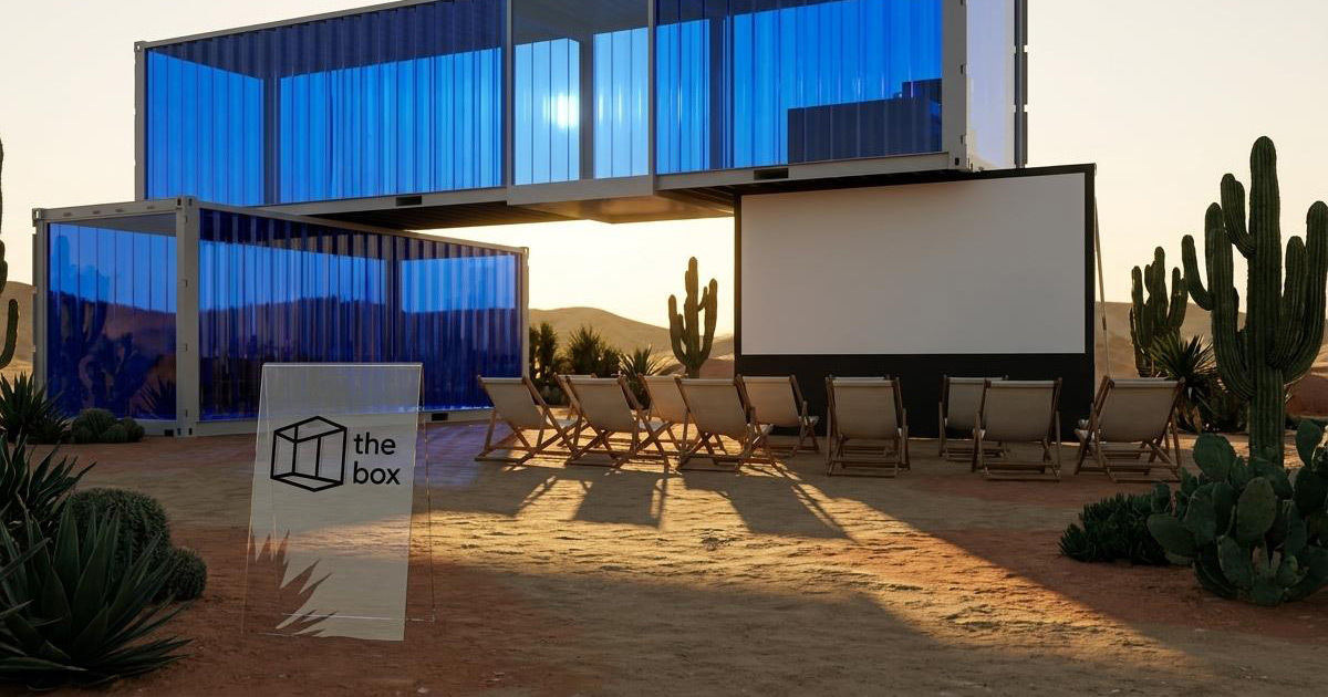
The Box is a UK multipurpose creative space, a venue whose entire proposition is adaptability. Whatever a client needs the space to become, The Box becomes it: cinema, event space, exhibition venue, creative studio, screening room. The name is the concept, and the concept is the brand. Mike Rock Studio built the brand identity and guidelines for a venue that challenged the most familiar creative instruction, think outside the box and turned it into something more interesting: what if the box itself, fully realised, was the most creative thing of all?

The Challenge:
Branding a multipurpose venue is a specific creative challenge because the brand has to work for every possible use of the space simultaneously. A cinema brand, an events brand, and a creative studio brand are three very different visual propositions and The Box needed to be all three without losing coherence or specificity. A generic identity that tried to communicate everything would communicate nothing. An identity that committed too specifically to one use would misrepresent the others.
The Box's own philosophy gave the solution its direction. The brief contained one of the most quietly radical creative statements in the portfolio: *being creative does not always mean thinking outside the box, but turning the box to its best version possible.* That inversion: the box not as limitation but as potential was the entire brand story. The identity needed to build on that idea with the confidence it deserved.

The Approach:
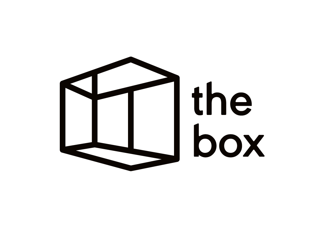
The box itself was the creative foundation — and the most versatile geometric form in visual language. A square or rectangle can become anything: a screen, a stage, a frame, a room, a canvas. The visual identity was built on that versatility, using the box as both the literal subject of the brand and the structural logic of the identity system. Every element was considered as a version of the box contained, precise, and capable of holding whatever the space needed to become.
The tone was built around the brand's philosophical inversion. Most creative venues define themselves by their freedom from constraint. The Box defined itself by its mastery of it — the conviction that a fully realised constraint is more interesting than its absence. That is a sophisticated creative position and the identity needed to carry it with equal sophistication: intelligent without being academic, confident without being cold, and versatile without being vague.
The guidelines were developed to reflect the multipurpose nature of the venue, a system flexible enough to serve every use case The Box was designed for, while maintaining the visual coherence of a brand that knows exactly what it is.

The Work:
Brand Identity:
A complete visual identity for The Box: logomark built on the geometric precision of the box form, typography, colour system, and the visual language of a UK multipurpose creative venue whose adaptability is its greatest asset. Contained, intelligent, and endlessly versatile.

Brand Guidelines:
A comprehensive guidelines document covering every application of The Box identity across cinema, events, exhibition, and creative studio contexts, a system that holds its coherence regardless of what the space is being used for.
The Outcome:
The Box launched with a brand identity that embodies its own philosophy: a mark and a system that demonstrate, through their design, the same principle the venue is built on: that the most creative thing you can do with a constraint is master it completely. The identity works across every use case The Box was designed for, adapting with the same ease as the space itself.
Thinking outside the box is easy. Turning the box into its best version that takes something more.

Project Details:
Services: Brand Identity · Logomark · Brand Guidelines
Industry: Creative Venue · Cinema · Events · Multipurpose Space
Location: United Kingdom
Market: UK Creative Industries · Events & Entertainment · Independent Cinema