Meal Prep Brand Identity Portugal
Lifekal is a lifestyle meal prep brand based in Portugal, built for people who want to eat well regardless of where they are, with meals calibrated to their individual dietary metrics. The proposition targets a specific and underserved frustration: that health food delivery services are inconsistent across locations, unreliable in how they handle customer dietary information, and often taste entirely different from one city to the next. Lifekal was created as a genuinely consistent alternative, a lifestyle brand, not just a food service. Mike Rock Studio built the complete brand: identity, packaging, and digital for a company whose approach to healthy eating was as considered as the meals it prepared.
[image]:
The Challenge
The health food and meal prep market is visually predictable. Green palettes, leaf motifs, clean sans-serifs, the same language of purity and wellness applied uniformly across a sector that has convinced itself that virtue and visual interest are mutually exclusive. Most health brands look exactly like health brands which means they blend into a category that a busy professional, scrolling through options on their phone, cannot meaningfully differentiate between.
Lifekal's proposition was distinctive, personalised metrics, consistent quality across locations, a lifestyle framing rather than a diet-culture framing but a brand that looked like every other health food service would undermine that distinction before the proposition was even read. The challenge was building a visual identity that was refreshing, bold, and immediately recognisable in a category that had standardised its own aesthetic, while carrying the quality signals that a health-conscious professional audience expects.

The Approach:
The design rationale was stated clearly in the brief and executed with conviction: simplicity and bold distinction, an organic reference that communicates quality without layering on meaning, and a contemporary appearance that felt familiar enough to be trusted and different enough to be noticed.
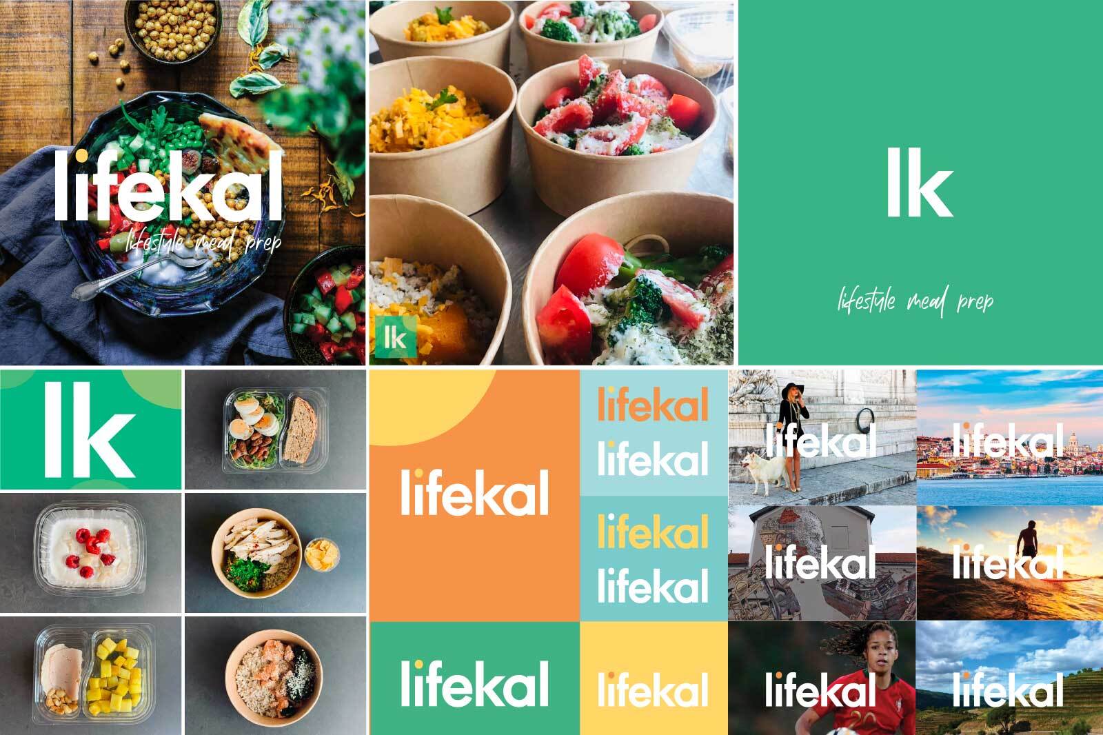
The logo delivers on all three. The bold, rounded sans-serif wordmark — lifekal, lowercase, generous in its weight and confident in its proportions — communicates approachability and warmth without the softness that can make health brands feel insubstantial. The single yellow-gold circle above the letter i is the mark's most important decision: not a leaf, not a plate, not a heart — just a circle, warm and sun-like, suggesting nourishment and vitality without announcing it. The handwritten "lifestyle meal prep" tagline beneath introduces a human, personal quality that the bold wordmark alone would lack. The combination is unpretentious, honest, and immediately recognisable.
The green — a specific, saturated teal-green rather than the muted sage of most health brands — was chosen to carry energy and confidence into a category that tends toward the delicate. It is the colour of a brand that takes health seriously without taking itself too seriously.
The packaging and digital systems extended that same balance across every touchpoint — from the meal containers a professional opens at their desk to the app interface where they set their dietary metrics.

The Work:
Brand Identity & Guidelines:
A complete visual identity for Lifekal: bold lowercase wordmark, warm teal-green and yellow-gold colour system, typography, and the brand language of a Portuguese lifestyle meal prep service built for people who refuse to compromise on what they eat, wherever they are.
Packaging:
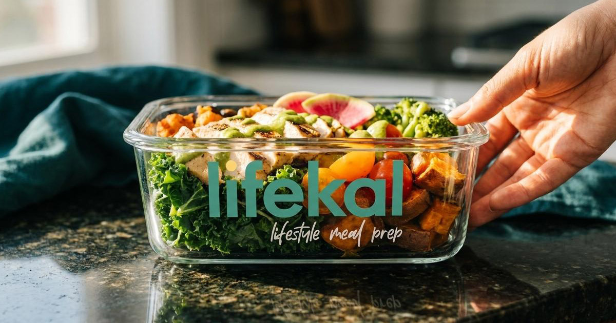
Meal prep packaging designed to carry the Lifekal identity into the most personal brand moment, the meal itself. Clean, confident, and immediately recognisable on a desk, in a gym bag, or on a kitchen counter.
Digital:
A digital identity built for the channels where Lifekal's audience discovers, orders, and manages their meal prep — a brand presence as considered as the service it represents.

The Outcome
Lifekal launched with a brand identity that stands out in a category that had forgotten how to. The bold wordmark, the warm palette, and the considered simplicity of the mark communicate a lifestyle brand rather than a diet product which is precisely the distinction Lifekal was built to make. A meal prep service for busy professionals who know what they want, served by a brand that looks like it does too.

Project Details
Services: Brand Identity · Logomark · Brand Guidelines · Packaging · Digital
Industry: Lifestyle · Meal Prep · Health Food · Food Delivery
Location: Portugal
Market: European Health Food · Busy Professionals · Lifestyle & Wellness