Padel Club Brand Identity UAE
Padel Nation launched into Dubai's rapidly growing padel market with a proposition that set it apart from the competition before a ball was hit: high-quality courts and equipment, affordable and accessible to players of all skill levels, and a space designed as much for community as for sport. Not just somewhere to play somewhere to belong. Mike Rock Studio built the brand identity and environmental design for a venue that understood, from the outset, that the game is only part of what people come for.
The Challenge:
Padel is one of the fastest-growing sports in the UAE. What was a niche pursuit a few years ago is now a mainstream fixture in Dubai's active lifestyle culture and the market has filled accordingly. New courts and venues are opening regularly, competing for the same pool of players across a city where sporting options are abundant and brand loyalty is hard-won.
Padel Nation identified a genuine gap: not at the premium end of the market, where exclusive club membership and aspirational pricing set the tone, but in the middle, high quality without the barrier, community without the exclusivity. A place where a seasoned player and a complete beginner could turn up on the same day and both feel they were in the right place.
The creative challenge was building a brand that communicated that accessibility and community warmth while still carrying the energy and confidence a sport brand needs. Too soft and it loses the competitive edge; too hard and it loses the people who just want a good game and a good time afterwards.
The Approach:
The community angle was the creative foundation. Padel is inherently social, it's a doubles sport, played on an enclosed glass court, where the game is as much about the banter between points as the points themselves. The brand needed to reflect that reality rather than defaulting to the individual athletic heroism that dominates most sports marketing.
The visual direction was built around energy, openness, and belonging. A brand that feels like it's already mid-conversation, warm enough to welcome a first-timer, confident enough to earn the respect of a regular. The identity needed to carry that character across everything from a court-side logo to a street-facing sign, and to perform in the demanding physical environment of an active sports venue, bold enough to read at distance, durable enough to survive daily use.
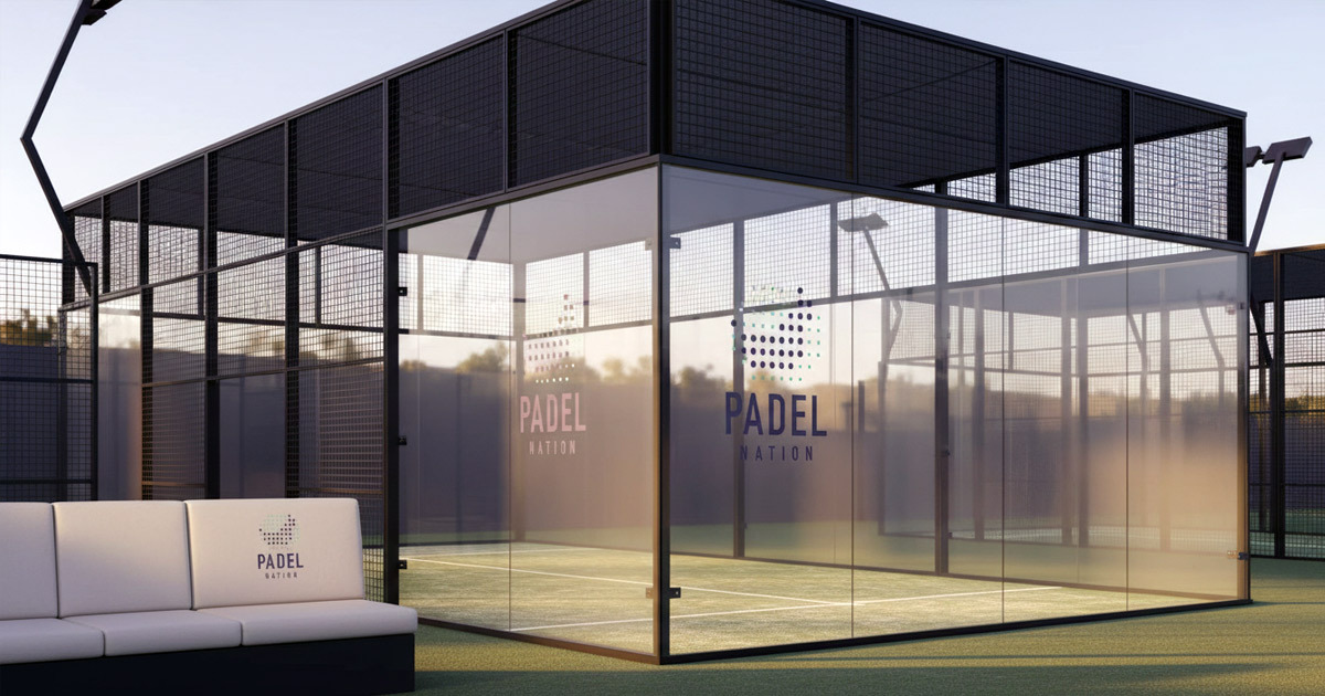
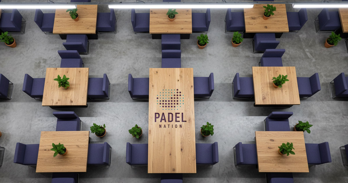
Environmental design was a central part of the brief, not an afterthought. The way a venue looks on approach, inside the courts, in the common areas — these are the moments where the brand either builds community or fails to. Every surface was considered as an opportunity to reinforce what Padel Nation is: the place you come to play, stay, and come back to.
The Work:
Brand Identity:
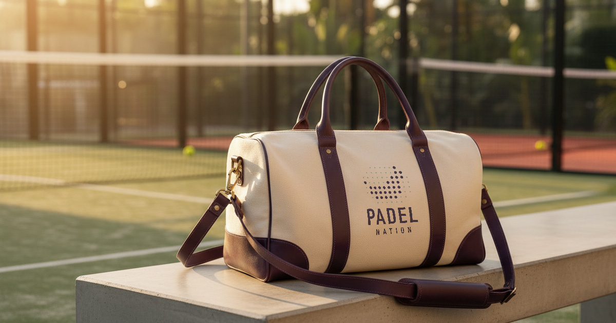
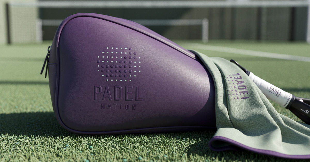
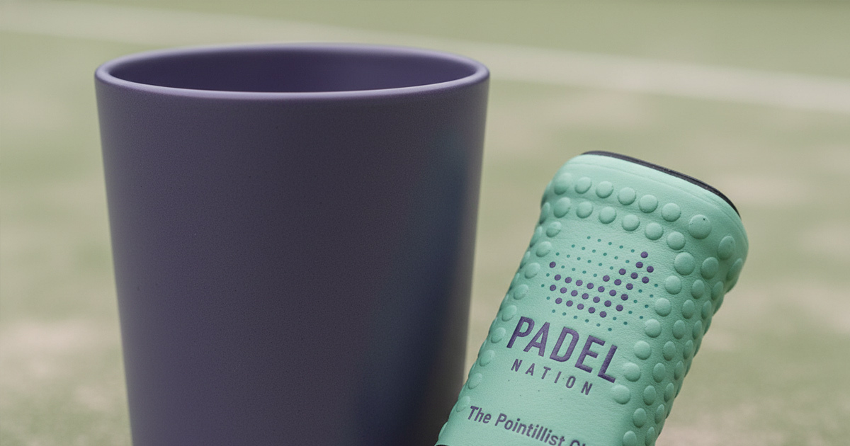
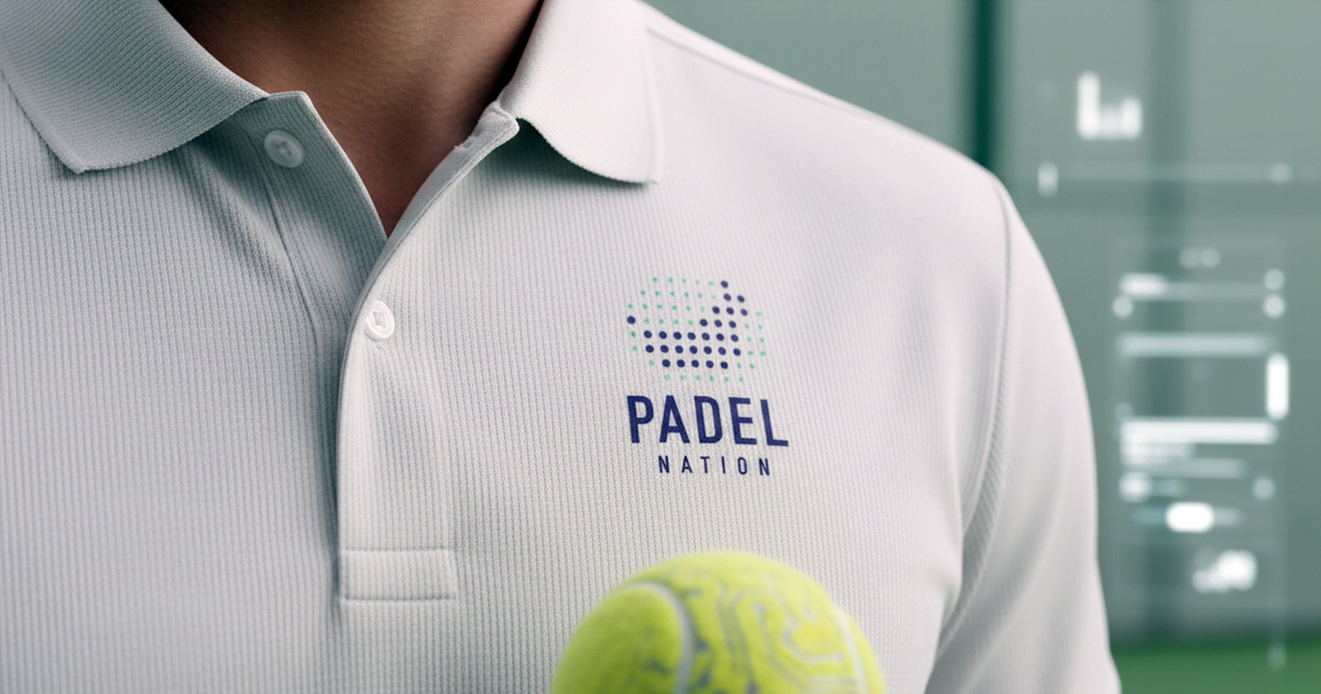
A complete visual identity for Padel Nation: logomark, typography, colour system, and the visual language of a community sports brand built for Dubai's active lifestyle market. Bold enough for a sports environment, warm enough for the social space around it.
Environmental & Signage Design:
The identity carried through the physical venue: court-side graphics, signage, wayfinding, and environmental applications designed to make Padel Nation feel like a place with genuine character from the moment you arrive to the moment you leave.
The Outcome:
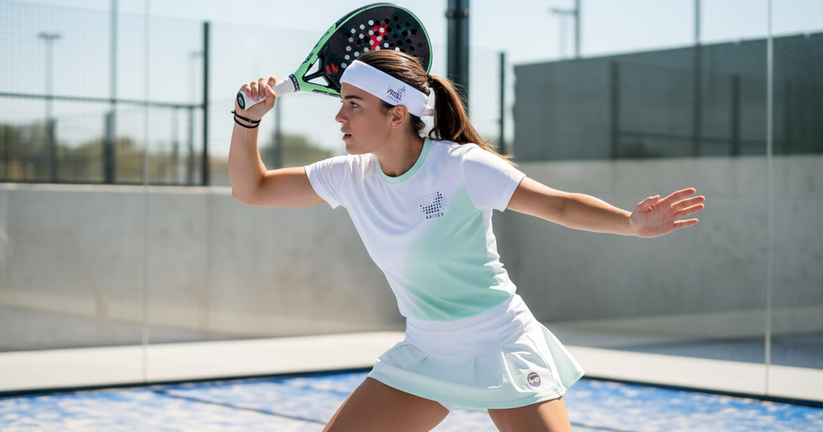
Padel Nation launched with a brand and environment that does what the brief asked: it feels like a community before you've played a single point. The visual identity is bold and energetic in the right places, warm and welcoming in the others and consistent enough across the physical space that the venue has its own distinct character in a market that is filling up fast.
Dubai's padel scene is growing. Padel Nation has a brand built to grow with it.
Project Details:
Services: Brand Identity · Logomark · Brand Guidelines · Environmental Design · Signage
Industry: Sport · Active Lifestyle · Leisure · Community Venue
Location: Dubai, UAE
Market: Dubai Active Lifestyle · UAE Sports & Leisure