Climbing Café Brand Thailand | Grip & Grind
Project Summary:
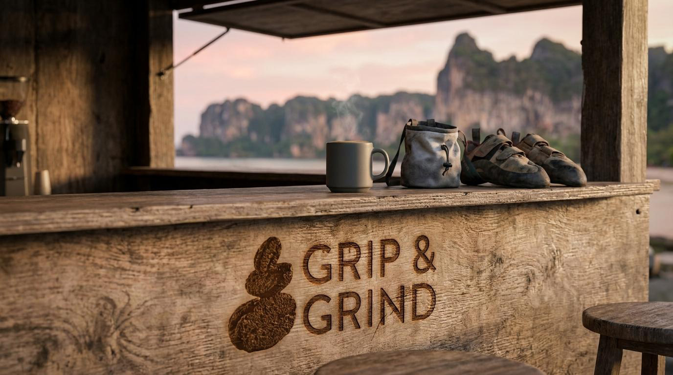
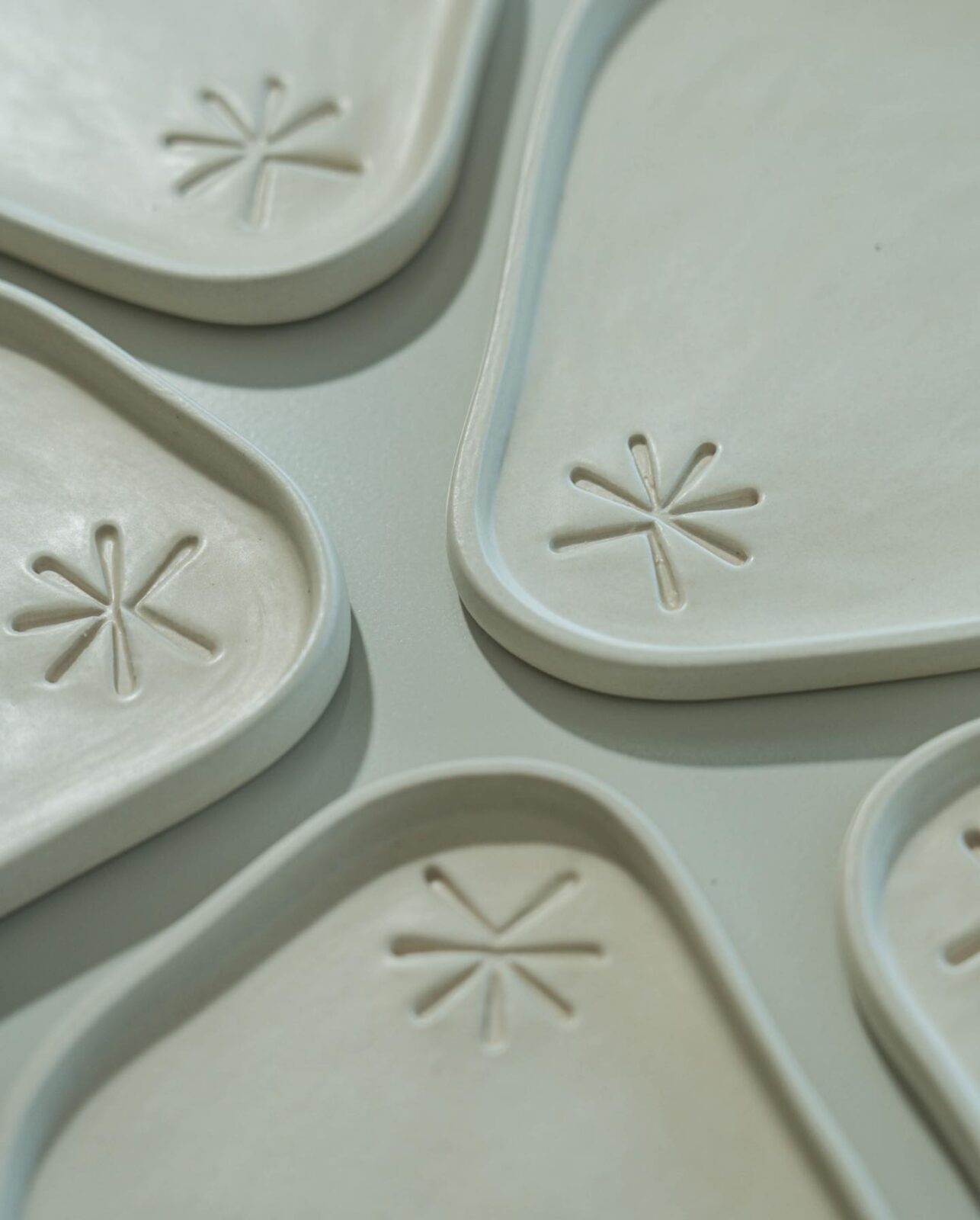
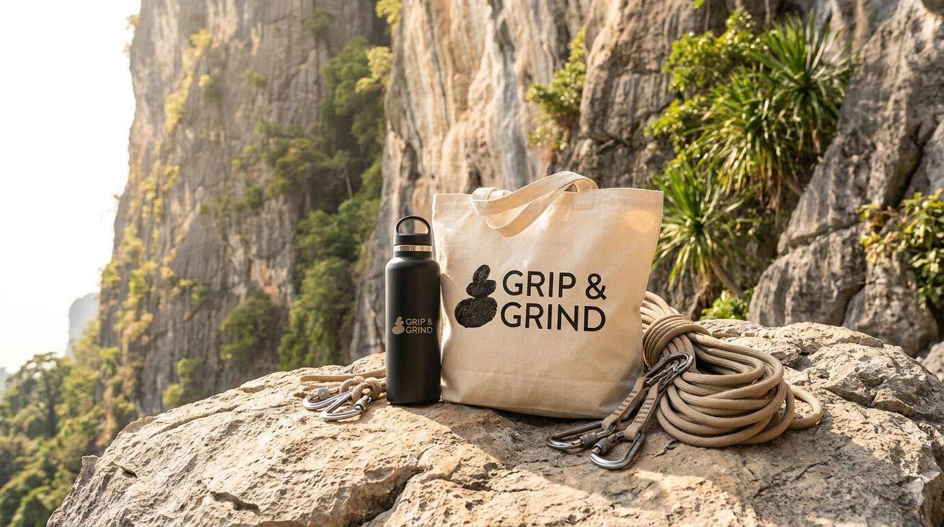
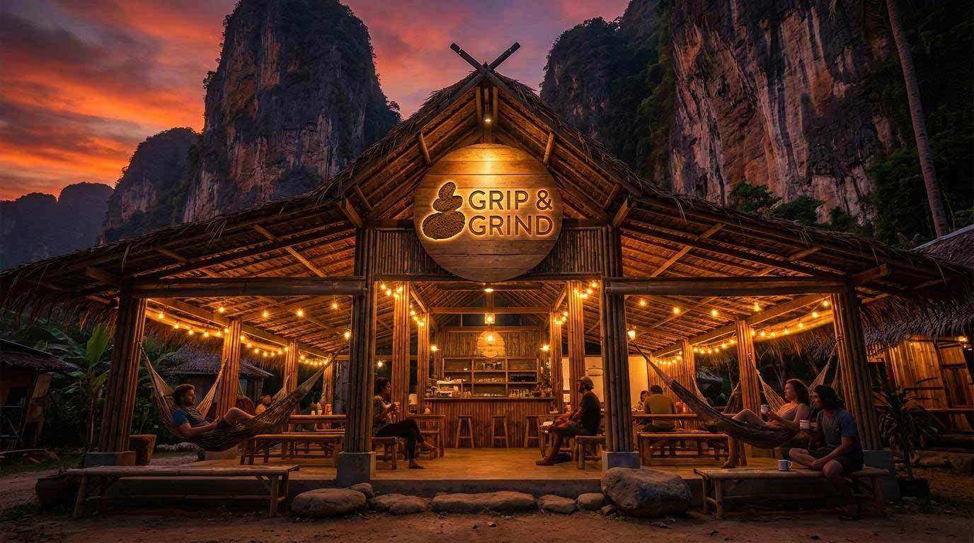
Grip & Grind is a specialty coffee shop in Railay, Thailand, located near Diamond Cave on one of the most celebrated rock climbing destinations in Southeast Asia. Serving specialty coffee, fresh smoothies, and homemade pastries, it is a natural gathering point for climbers finishing a route and travellers looking for a place to settle into the island rhythm. The shop also sells handmade ceramics and eco-friendly products, adding a craft dimension to a café that is already defined by its setting. Mike Rock Studio built the brand identity and guidelines from scratch for a business with a clear sense of what it is and a name that says it perfectly.
The Challenge:
A coffee shop in Railay could easily lean into generic tropical café aesthetics: palm leaf motifs, hammock illustrations, the visual shorthand of island life that tells you nothing specific about the place you're in. Grip & Grind had something more interesting to work with. Its name is a double reference: the grip of a climber's hand on limestone, and the grind of coffee beans, two acts that require the same combination of patience, precision, and physical presence. The brand needed to honour both without literally illustrating either.
The audience spans two different kinds of people who are united by the same disposition: climbers who have come to Railay for the rock, and travellers who have come for the island. Both move slowly by choice. Both are looking for something worth finding rather than something obviously marketed at them. A brand that felt too designed, too polished, or too eager to communicate its own personality would ring false for either group.
The Approach:
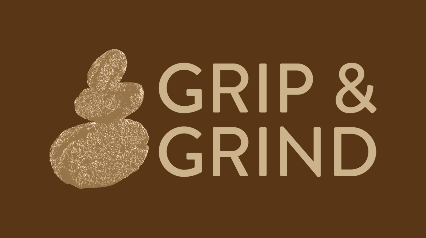
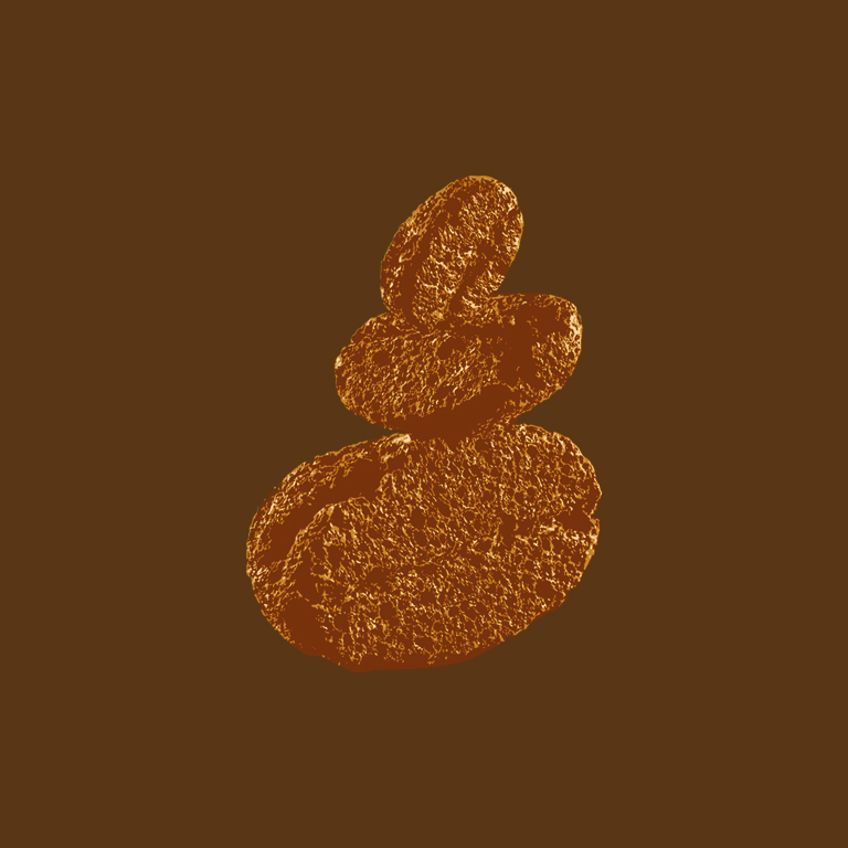
The logomark is the case study. The stacked stone form, three organic shapes balanced on each other, rendered in the warm gold that runs throughout the identity, carries both of the brand's core references simultaneously without announcing either of them. Read as a climber, it is a rock stack, one of the trail markers and meditative objects that appear on climbing and hiking routes worldwide. Read as a coffee drinker, it is three coffee beans, the raw material of every cup. The ambiguity is the point: a mark that means something different to everyone who encounters it, and something true to both.
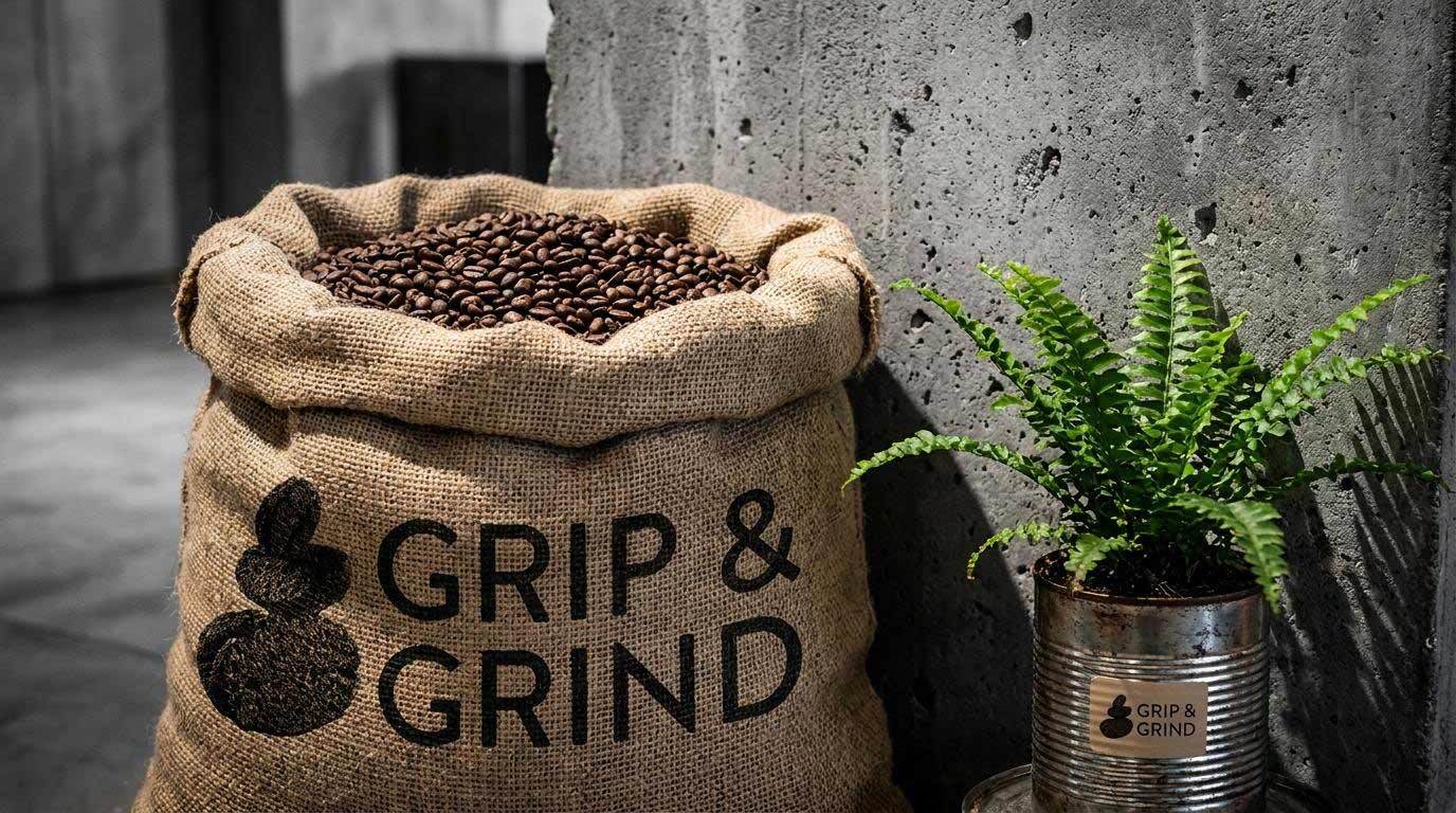
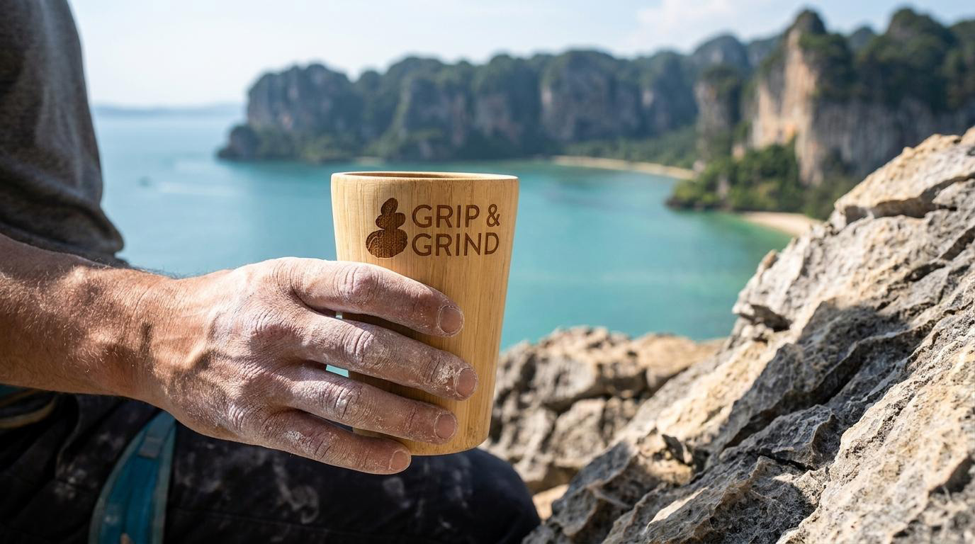
The rounded, generous sans-serif wordmark: GRIP & GRIND in tracked capitals provides the structural contrast to the organic mark. Where the stacked stones are irregular and tactile, the type is clean, precise, and easy to read at the scale of a cup sleeve or a signboard in direct sunlight. The combination of natural texture and typographic clarity mirrors the experience of Railay itself: rugged limestone and clear water, demanding beauty and effortless charm.
The warm gold palette was the only colour choice. It references the specific tone of a well-pulled espresso, the warmth of afternoon light on limestone, and the natural materials of handmade ceramics simultaneously. It is the colour of the island at the end of the day, which is when most people find Grip & Grind.
The Work:
Brand Identity:
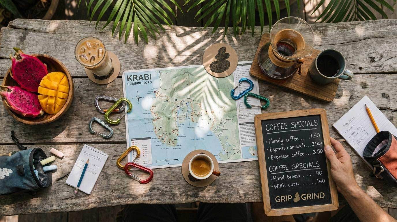
A complete visual identity for Grip & Grind: the stacked stone logomark, rounded sans-serif wordmark, warm gold colour system, and the visual language of a specialty coffee shop built for climbers and travellers on one of Thailand's most distinctive islands.
Brand Guidelines:
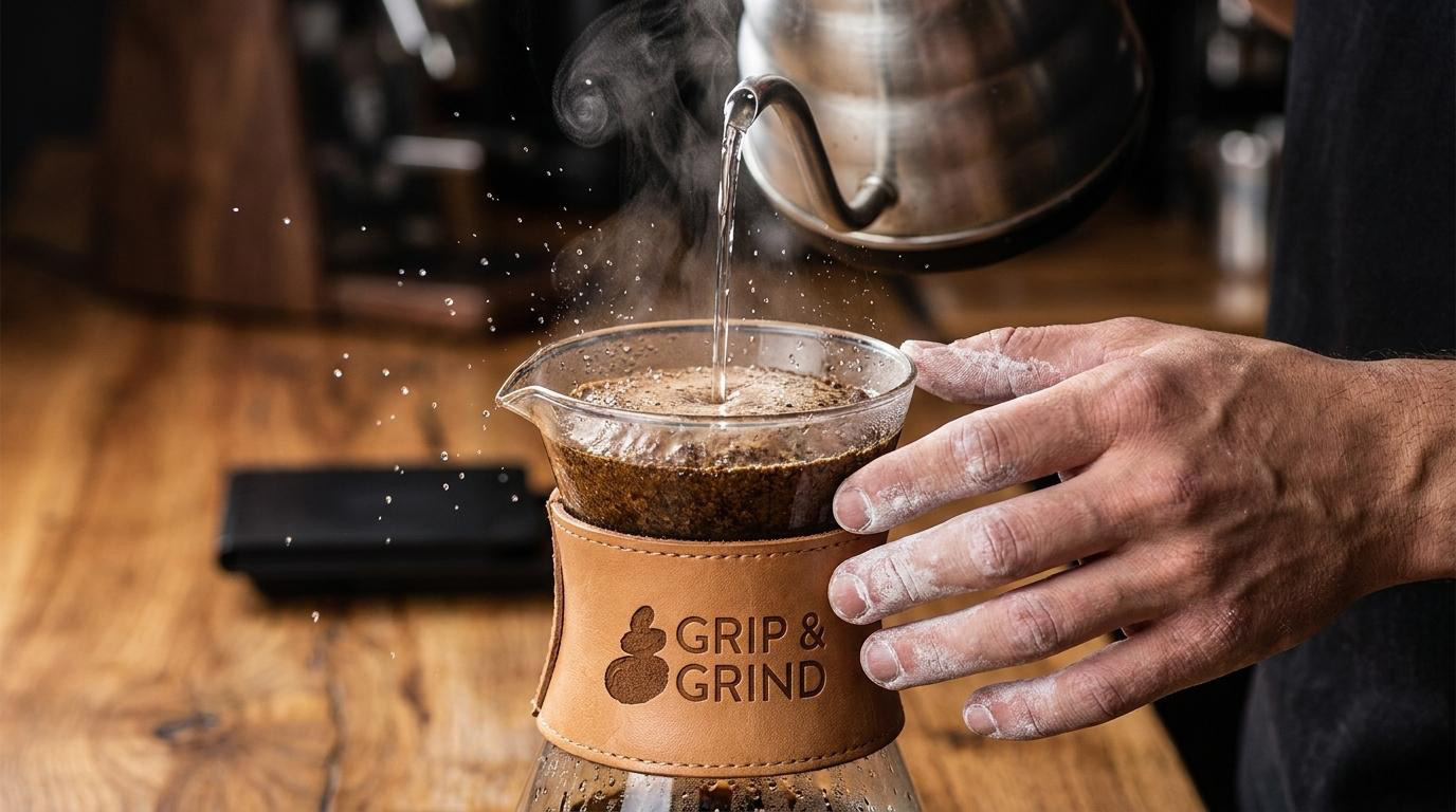
A guidelines document covering every application of the Grip & Grind identity, ensuring the warmth and character of the brand are consistent across cups, signage, packaging, ceramics, and the digital presence of a café that earns its following through the quality of the experience it delivers.
The Outcome:
Grip & Grind opened with a brand identity that feels as naturally at home in Railay as the café itself. The stacked stone mark is immediately legible to anyone who has ever balanced rocks on a beach or gripped limestone on a wall, and the warm gold palette gives the brand a warmth and character that stands apart from the generic tropical café aesthetic without trying to. A coffee shop near Diamond Cave, with a brand that knows exactly where it is.
Project Details:
Services: Brand Identity, Logomark, Brand Guidelines
Industry: Specialty Coffee, Café, Eco-Lifestyle, Climbing Culture
Location: Railay, Krabi, Thailand
Market: Southeast Asia Travel, Climbing Community, Eco-Tourism