Café Brand Identity Saudi Arabia
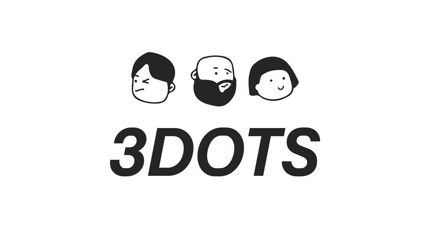
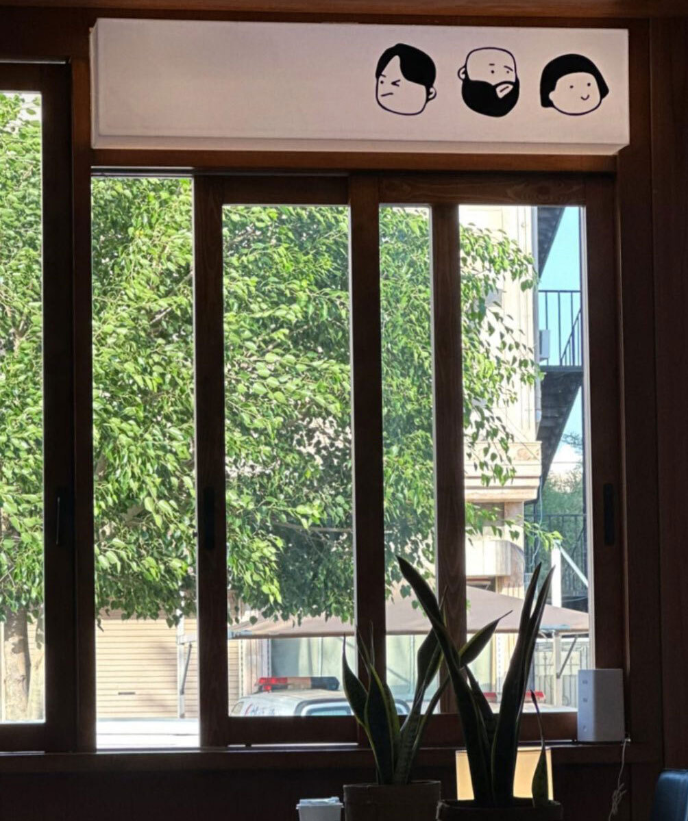
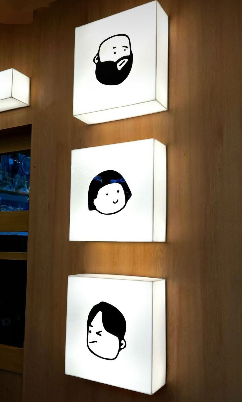
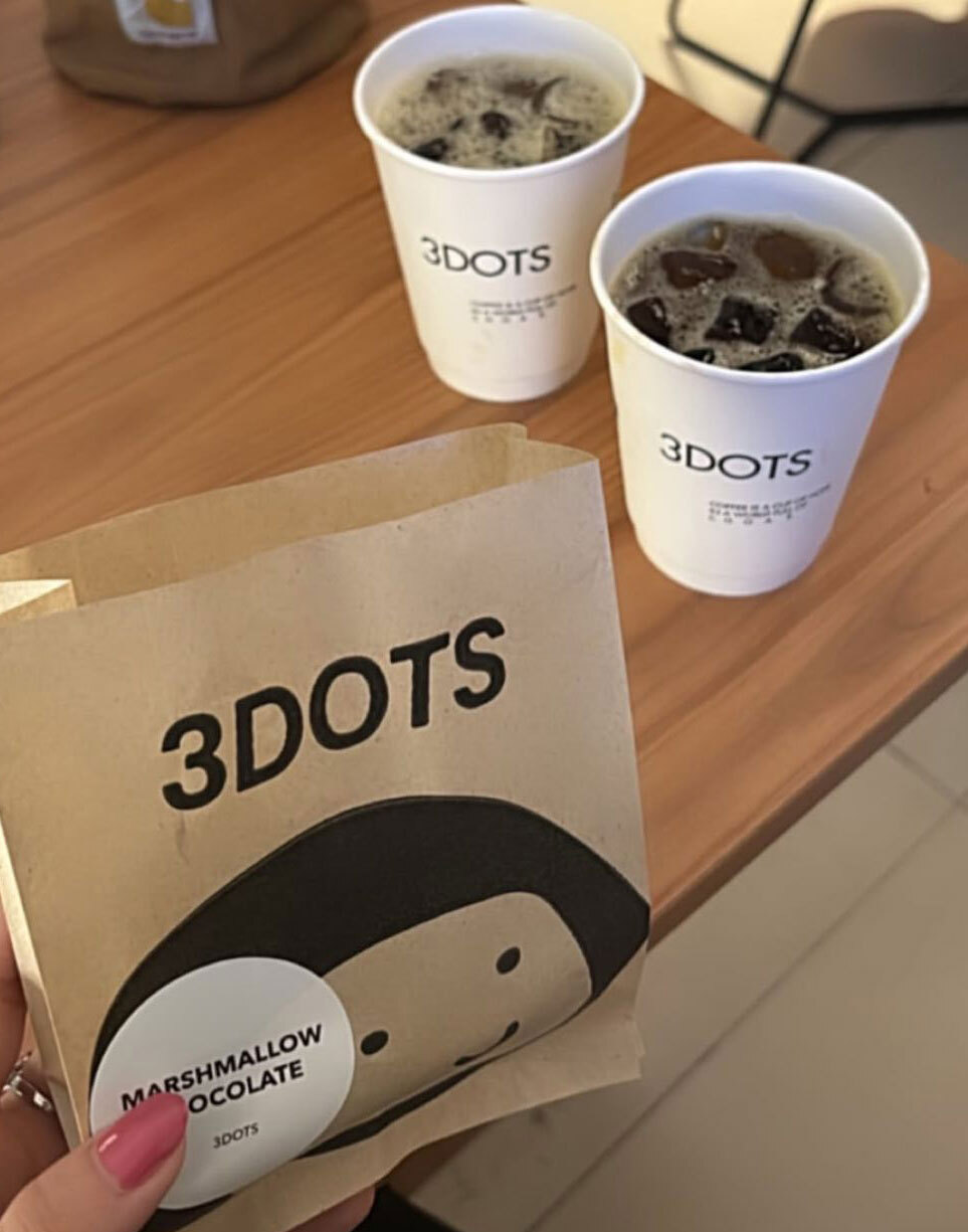
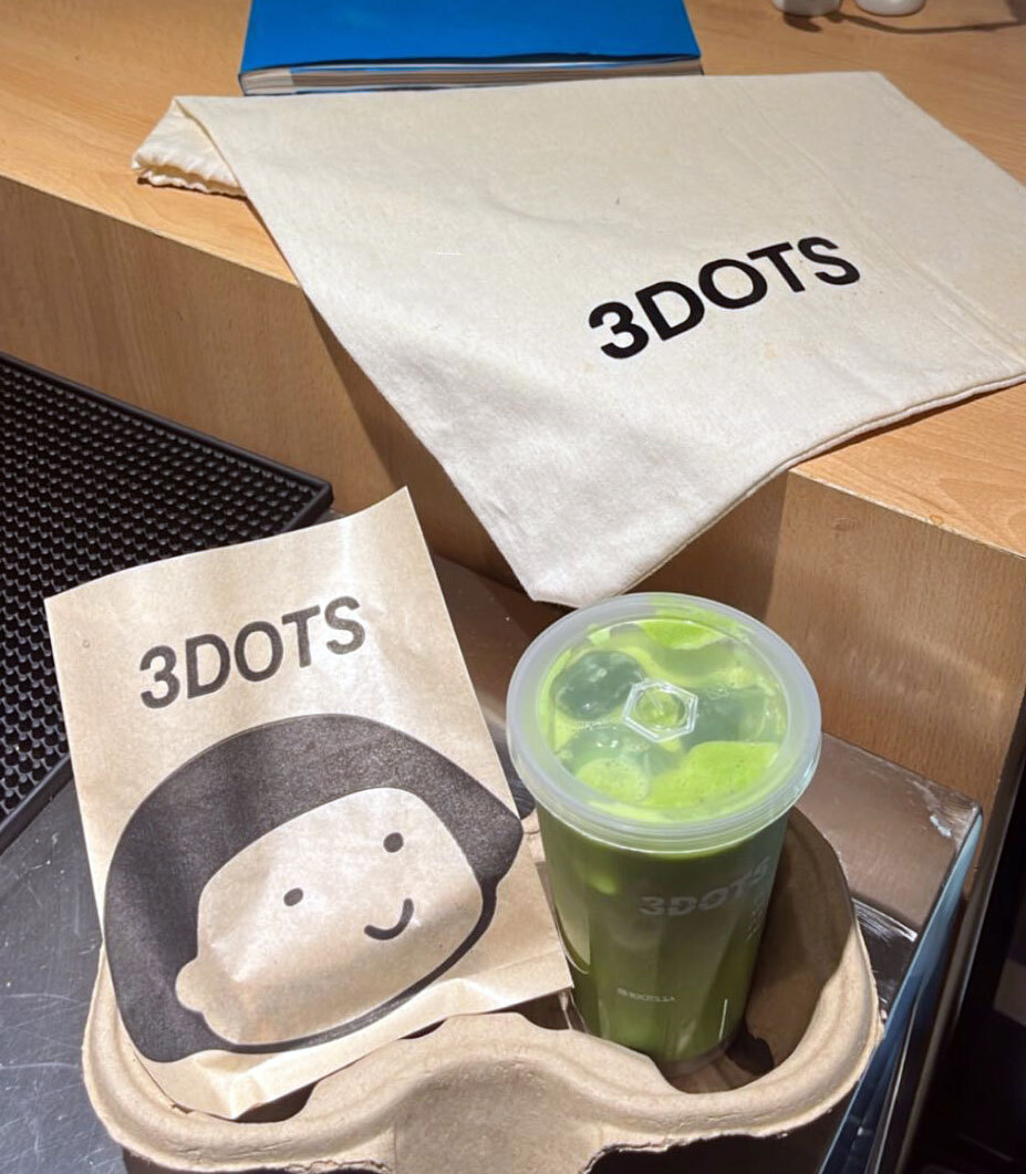
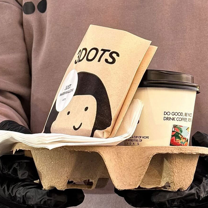
3 Dots is a Saudi café brand built around two words that contain everything worth saying about a good place to eat and drink: Family and Friends. The name is the concept and the concept is the mark: three illustrated faces, grumpy, bearded, happy sitting above a bold italic wordmark, each face as distinct as the people who walk through the door. Mike Rock Studio built the brand identity for a café that understood its real purpose before a single brief was written, and expressed it in a mark that makes you smile before you've read a word.
The Challenge:
The café market in Saudi Arabia has developed with extraordinary speed. In Riyadh and Jeddah particularly, the standard of visual presentation among new openings is high, consumers are sophisticated, competition is constant, and a new brand has a very short window to communicate why it deserves their time. In that environment, a café built on something as genuinely simple as family and friends faces a specific creative risk: sincerity can easily tip into sentimentality, and warmth without visual confidence reads as ordinary.
The brief was to build a brand that felt as warm and unforced as the social experience it was designed to host without looking like every other family-friendly café in the market. The name itself was the starting point: three dots, three people, three distinct personalities in a single mark. Not an abstract concept something that looks like the people it was made for.
The Approach:
The three illustrated faces are doing the work that most café logos never attempt: communicating personality before the brand name is read. The grumpy face, the bearded face, the happy face — three archetypes that anyone who has ever gone for coffee with people they care about will immediately recognise. They are the people at the table. They are the regulars. They are family and friends, expressed in three simple drawn characters that carry warmth without effort.
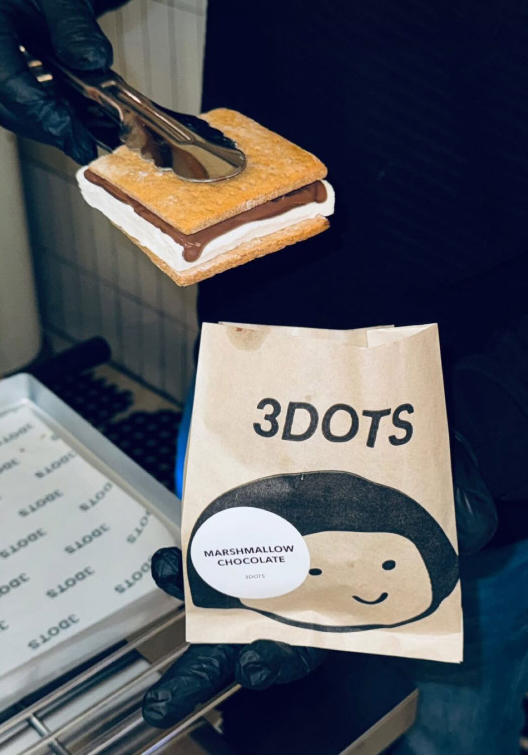
The bold italic 3DOTS wordmark grounds the illustration with confidence and weight. The typeface is decisive rather than soft, which prevents the illustrated faces from tipping the brand into generic cheerfulness. The combination holds the tension the brief required: genuinely warm, visually confident, immediately its own.
The Family and Friends proposition shaped every creative decision. In the Saudi market, where hospitality and communal gathering are genuinely central to daily life, that proposition is not marketing language. It is a statement of cultural truth, and the identity earns it through a mark that looks like the people it is made for rather than the aspiration it is selling.
The Work:
Brand Identity:
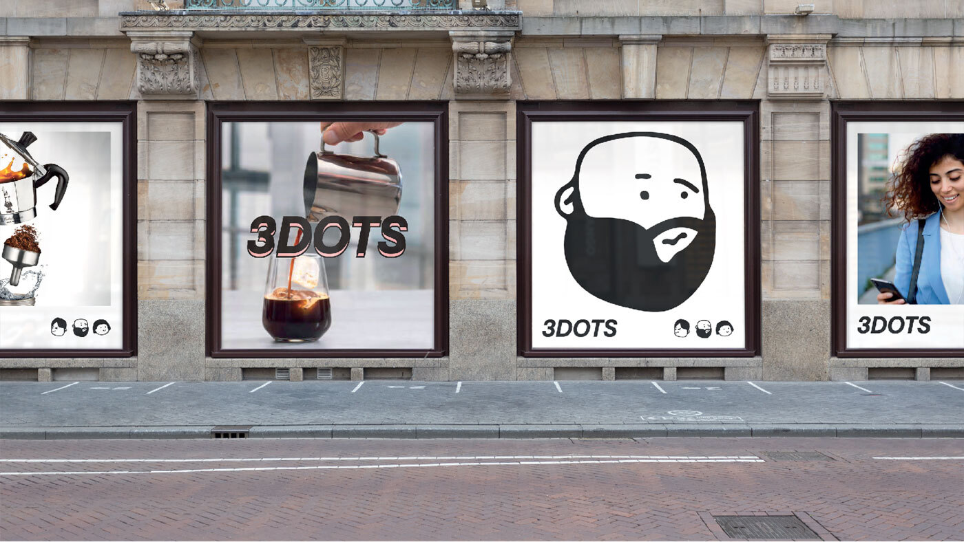
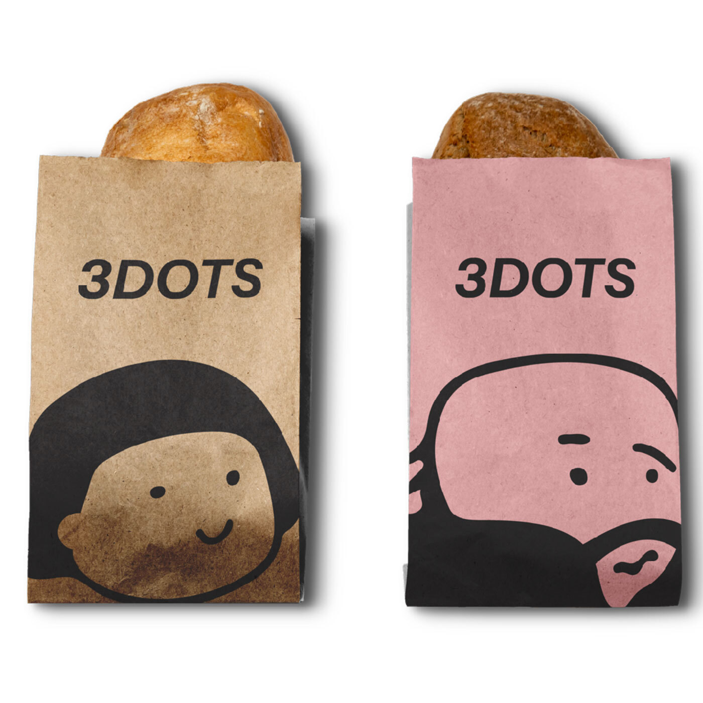
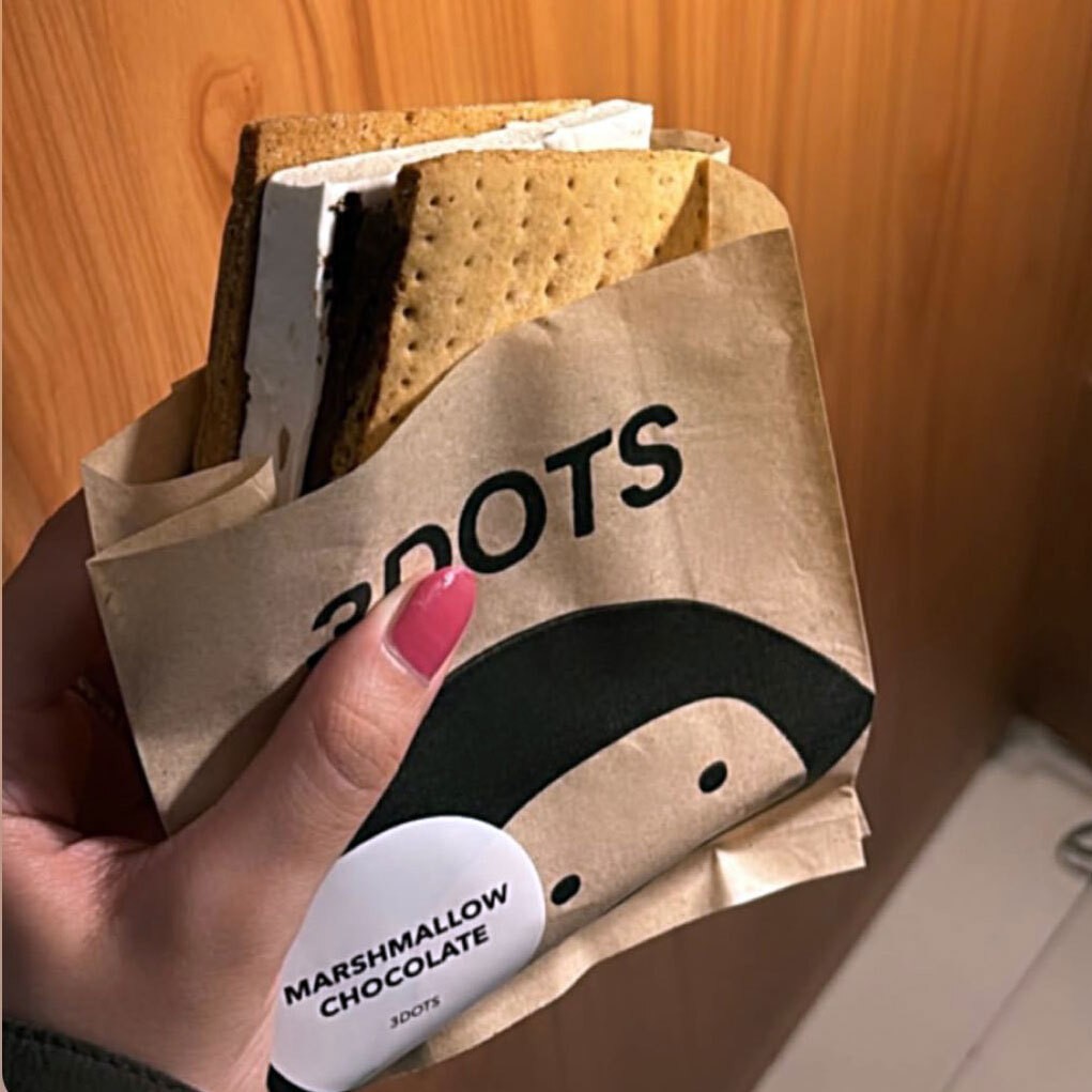
A complete visual identity for 3 Dots: three illustrated character faces as the primary mark, bold italic wordmark, and the visual language of a Saudi café brand whose warmth is expressed through character rather than convention.
The Outcome:
3 Dots launched with a brand identity that earns its name. The three faces are simple enough to be remembered after a single encounter and specific enough to feel like they belong to this café and no other. The mark communicates warmth, ease, and the specific pleasure of a place designed for the people who matter most without needing to explain itself.
Three faces. Three dots. And then the conversation continues.
Project Details
Services: Brand Identity · Logomark · Brand Guidelines
Industry: Café · Food & Beverage · Social Dining
Location: Saudi Arabia
Market: KSA Café · GCC Social Dining