Luxury Acquisition and Advisory Brand
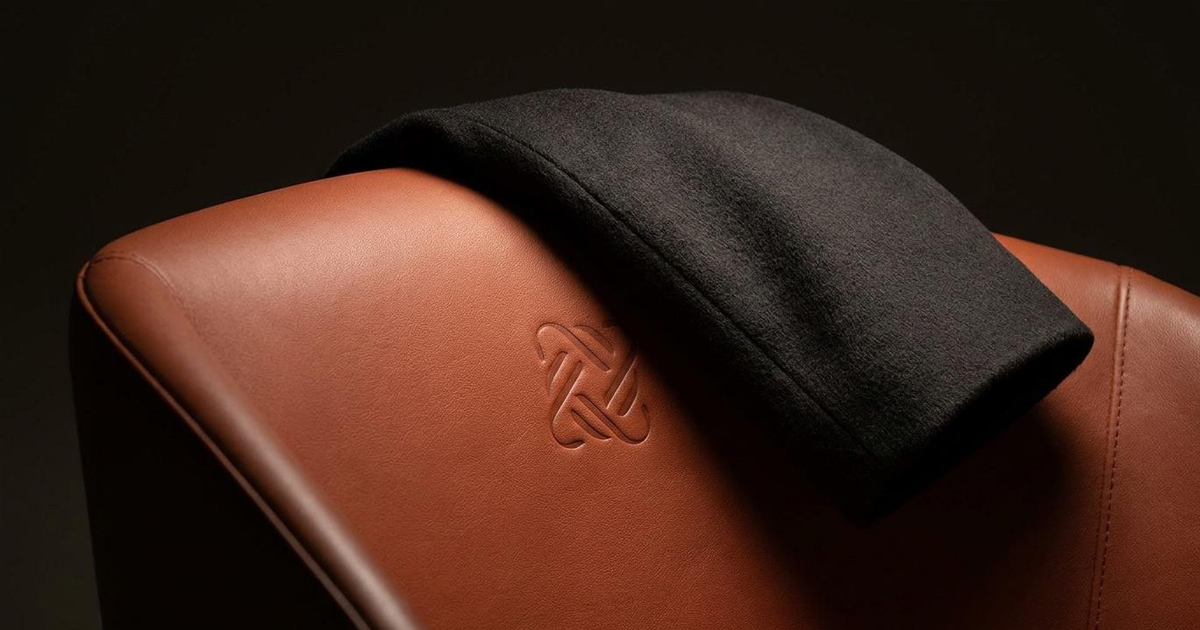
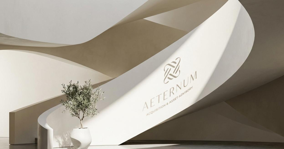
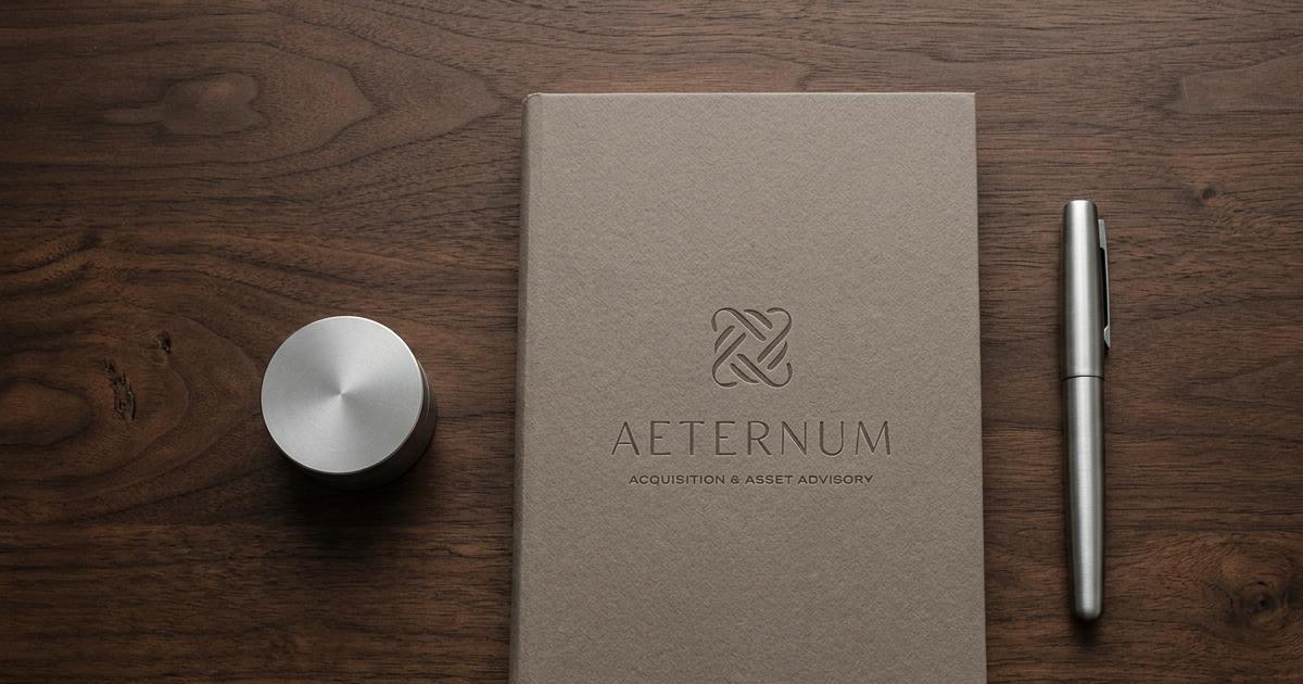
Aeternum is a luxury acquisition and asset advisory firm serving ultra high net worth and high net worth private clients in Dubai, specialising in design-led residential properties. The firm offers two core services: the acquisition of exceptional homes built around architectural and design distinction, and the optimisation of existing properties to achieve design excellence. The name says everything the brand needed to say before the identity was even begun: Aeternum, Latin for eternal, timeless, everlasting. Mike Rock Studio built the brand identity and guidelines from scratch, delivering a custom typeface and bespoke mark that embody the firm's ethos at every scale.

The Challenge:
Luxury real estate advisory in Dubai operates at a level where the quality of the brief is matched only by the quality of the audience evaluating it. Ultra high net worth clients choosing an advisor for the acquisition of a design-led home are making decisions where financial consequence and personal taste are equally at stake. A brand that communicates prestige without depth, or refinement without rigour, will not earn the trust of this audience.
The specific challenge for Aeternum was that its proposition was genuinely unusual. Most luxury real estate firms position around access, relationships, and market knowledge. Aeternum positioned around design: finding homes built around architectural distinction and optimising existing properties to meet a standard of design excellence. That is a different kind of expertise, and it required a different kind of brand to represent it.
The identity also had a practical brief with no room for compromise: custom type and a bespoke mark. For a firm whose name means timeless and whose proposition is built on the idea that genuine quality endures, a generic typeface or a template-derived mark would have been a direct contradiction of everything the firm stood for.

The Approach:
The creative brief was among the most precise in the portfolio: a sophisticated, timeless identity conveying exclusivity, expertise, and architectural refinement. Every word of that brief is doing specific work. Sophisticated rules out decoration. Timeless rules out trend. Exclusivity is not the same as expense. Expertise implies depth rather than polish. Architectural refinement references a specific and demanding standard of spatial thinking.
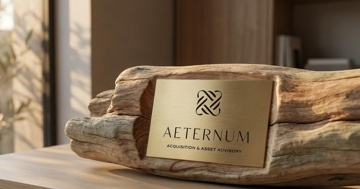
The custom typeface was built from those principles. Letterforms designed with the precision and proportion of architectural drawing rather than the warmth of conventional serif design: clean, structural, and carrying the specific quality of something drawn with a very sharp pencil. Every detail resolved, nothing arbitrary, the kind of typography that rewards close reading in the way that a well-designed building rewards being inside it.
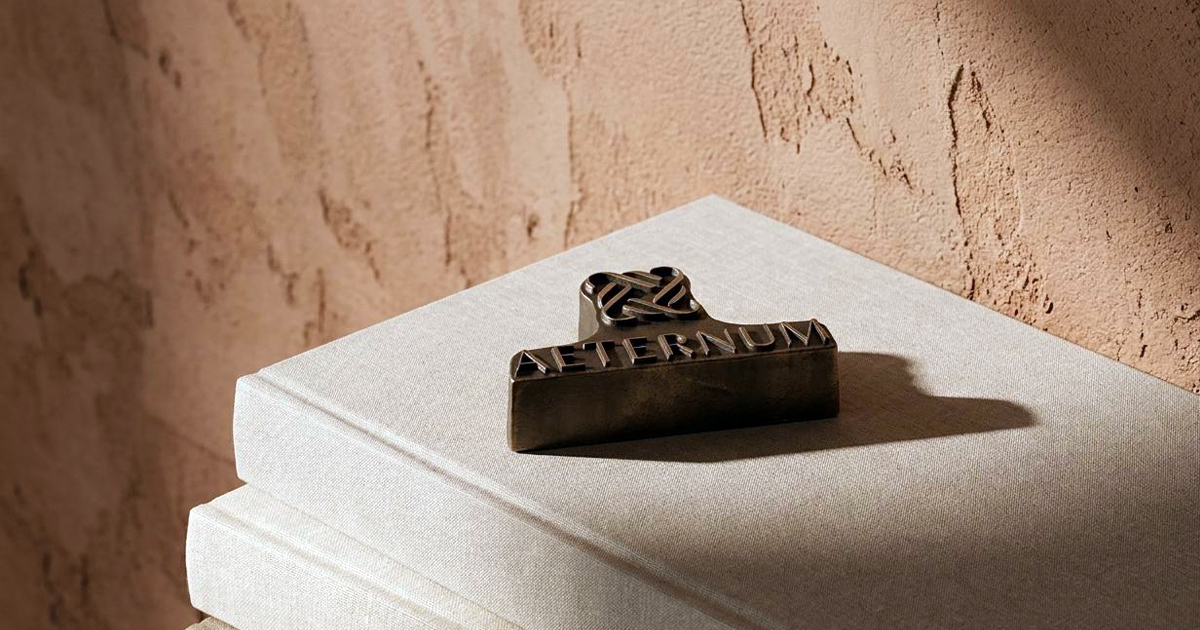
The bespoke mark operates on the same logic. Not a symbol that represents the brand, but a mark that embodies the same values the brand is built on: the careful composition of elements into something that is greater than the sum of its parts, resolved to a standard where nothing could be added or removed without diminishing the whole.
The Work:
Brand Identity:
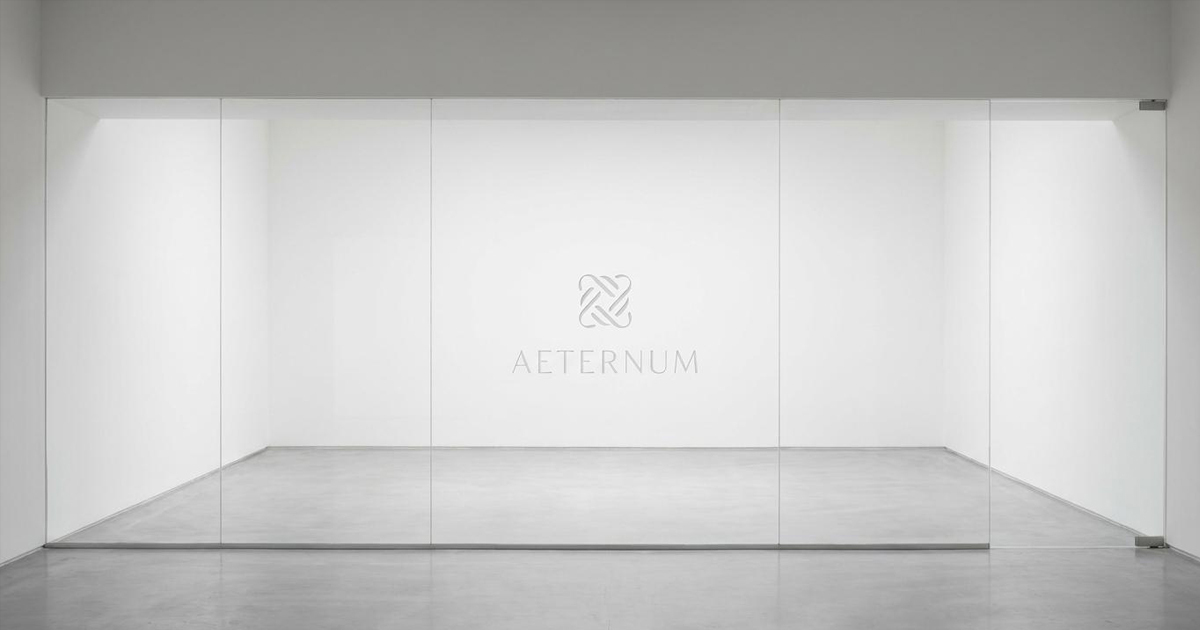
A complete visual identity for Aeternum, built around a custom typeface and bespoke logomark designed to communicate timeless luxury, architectural refinement, and the specific expertise of a design-led property advisory firm serving Dubai's most discerning clients.
Brand Guidelines:
A comprehensive guidelines document covering every application of the Aeternum identity, ensuring the precision and integrity of the custom type and mark are maintained consistently across every client-facing touchpoint.


The Outcome:
Aeternum has a brand identity that lives up to its name. The custom typeface and bespoke mark communicate the firm's proposition before any description of its services is required: that this is an advisory practice that applies the same standard of design thinking to its own presentation as it does to the properties it acquires and optimises for its clients. Timeless, by design.

Project Details:
Deliverables: Brand Identity, Custom Typeface, Bespoke Logomark, Brand Guidelines
Industry: Luxury Real Estate Advisory, Asset Advisory, Design-Led Property
Location: Dubai, UAE
Market: Dubai UHNWI, HNW Private Clients, Design-Led Luxury Residential