Specialty Coffee Brand
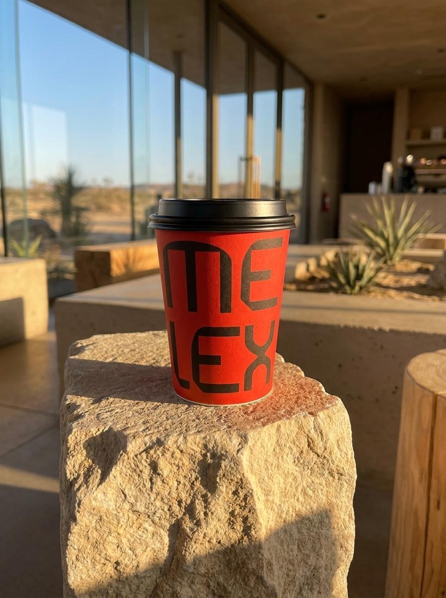
Melex Coffee is a Saudi specialty coffee brand built around a single, well-considered idea: that the world of exceptional coffee shouldn't feel exclusive. Founded to bridge the gap between the discerning connoisseur and the curious newcomer, Melex exists in Riyadh, Jeddah, and Dammam, urban centres where coffee culture is shifting rapidly and the appetite for quality is outpacing the brands available to satisfy it. Mike Rock Studio built the identity, packaging, digital presence, and collateral for a brand that needed to feel premium and approachable in the same breath.
The Challenge:
Saudi Arabia's coffee market is in a genuine moment of transition. Specialty coffee, the kind that comes with provenance, process, and a story — is moving from niche to mainstream among the country's urban 22–45 demographic. The opportunity was clear. The danger was equally clear: a brand that leaned too heavily into coffee connoisseurship would alienate the curious newcomer; one that played too safe would fail to earn the respect of the discerning drinker who already knows the difference.
Melex needed to occupy both spaces simultaneously credible enough for the expert, welcoming enough for the first-timer without feeling like it was trying to be everything to everyone. That's a narrow brief to execute well.
The Approach:
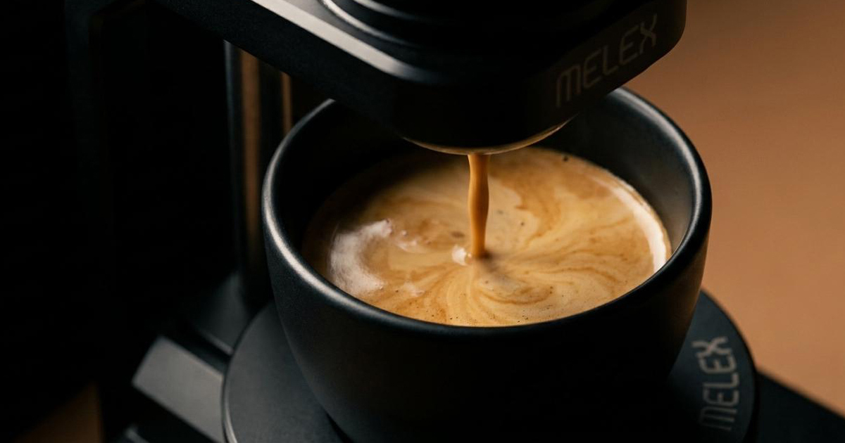
The creative strategy centred on the word Melex itself and what the brand needed to feel like in the hand, on a shelf, and in a café environment across Saudi Arabia's most competitive urban markets.
The positioning was defined as the bridge: between exclusive and accessible, between craft and culture, between the ritual of specialty coffee and the warmth of community. Every visual decision was made in service of that tension — resolving it rather than ignoring it.
The identity was designed to carry authority without intimidation. Clean, considered, and culturally relevant to an audience that values quality, authenticity, and innovation — and that is acutely sensitive to brands that perform these qualities rather than embody them. In a market moving this fast, the difference between genuine and constructed is immediately visible to the people you most want to reach.
The Work:
Brand Identity & Guidelines:
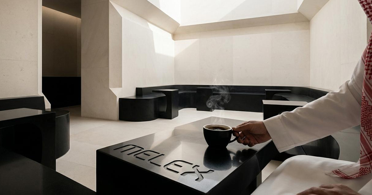
A complete visual identity system — logomark, typography, colour, and a comprehensive guidelines document covering every application. Built to scale consistently across multiple locations and formats without losing coherence.
Packaging:
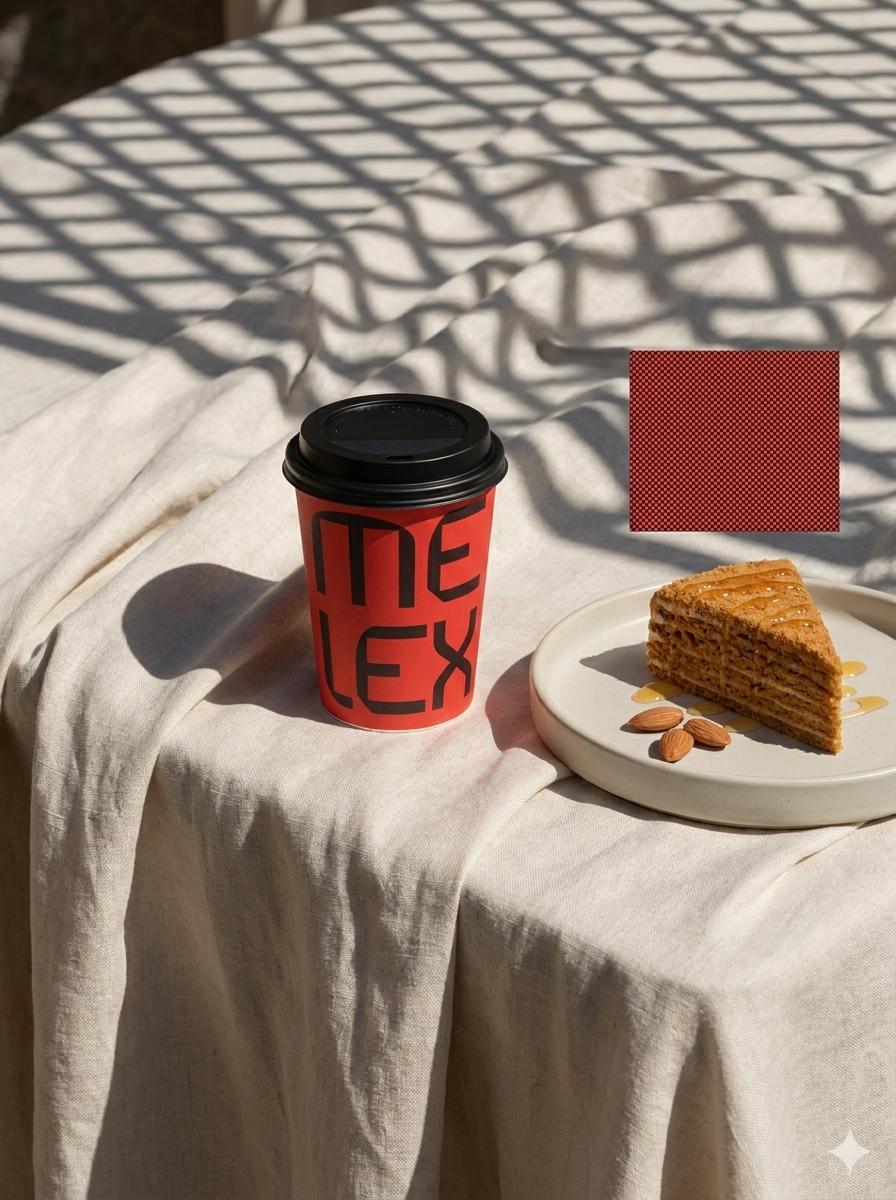
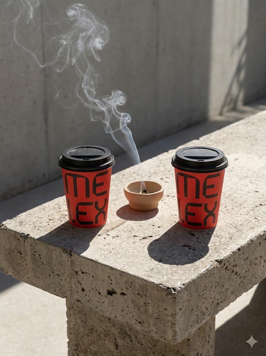
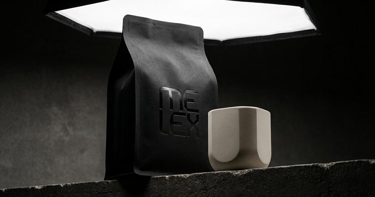
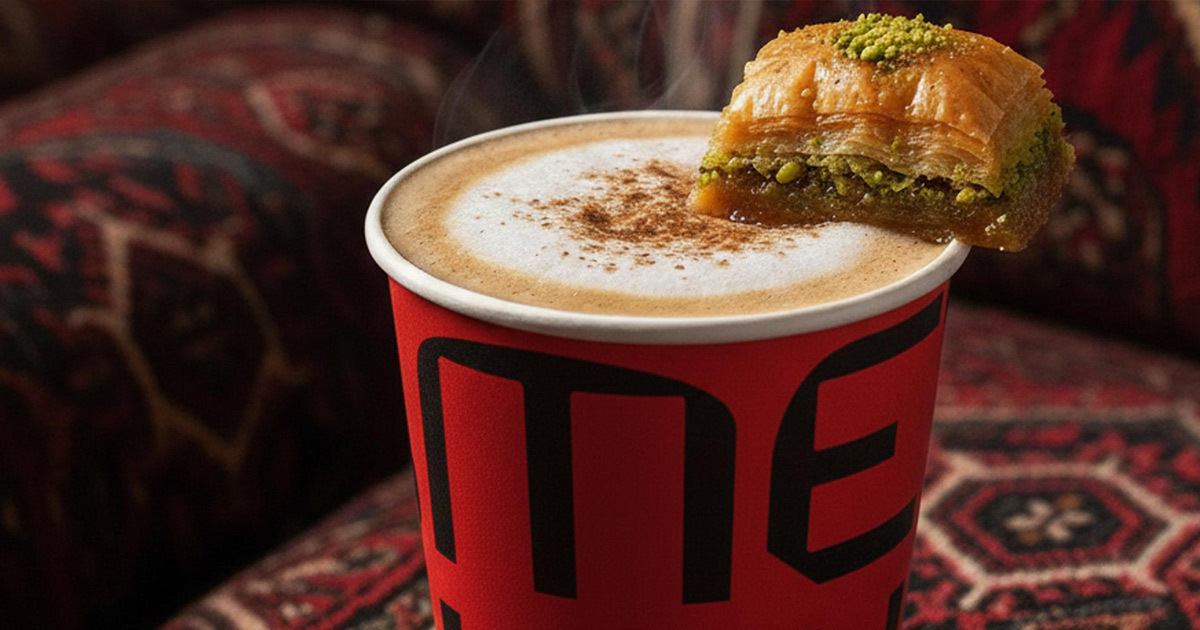
Coffee packaging designed to communicate craft and quality at the point of decision where the product sits on a shelf or arrives at a table and needs to earn its premium positioning in a glance. Every finish and format considered as part of the brand experience.

Digital & Collateral:
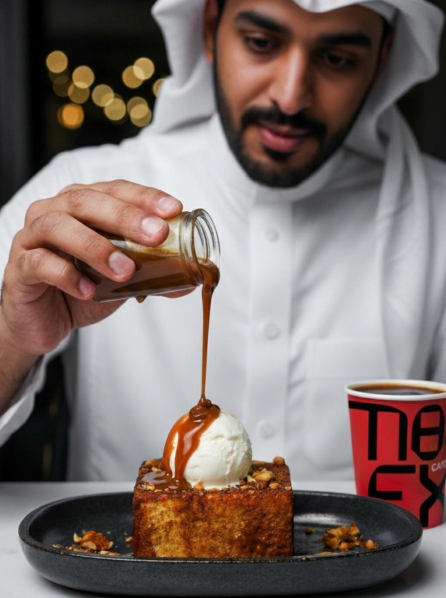
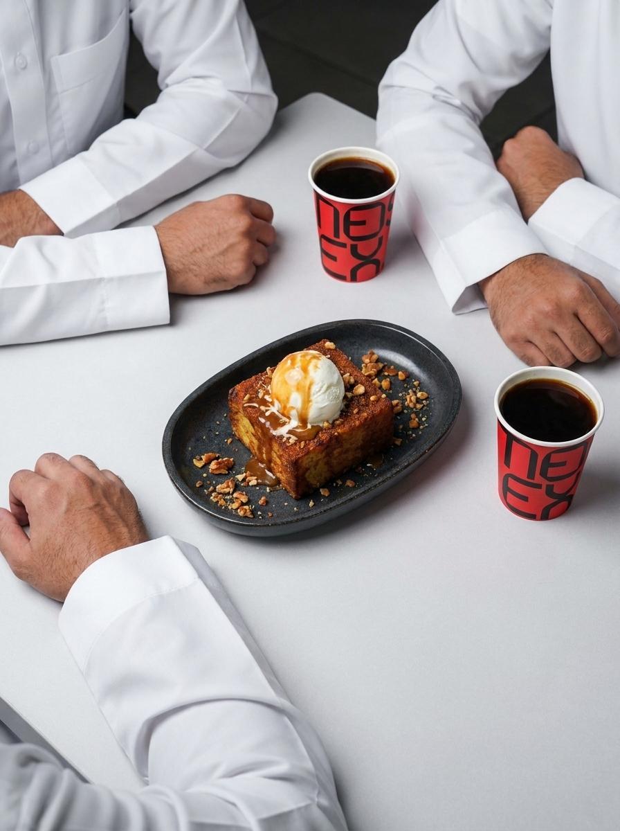
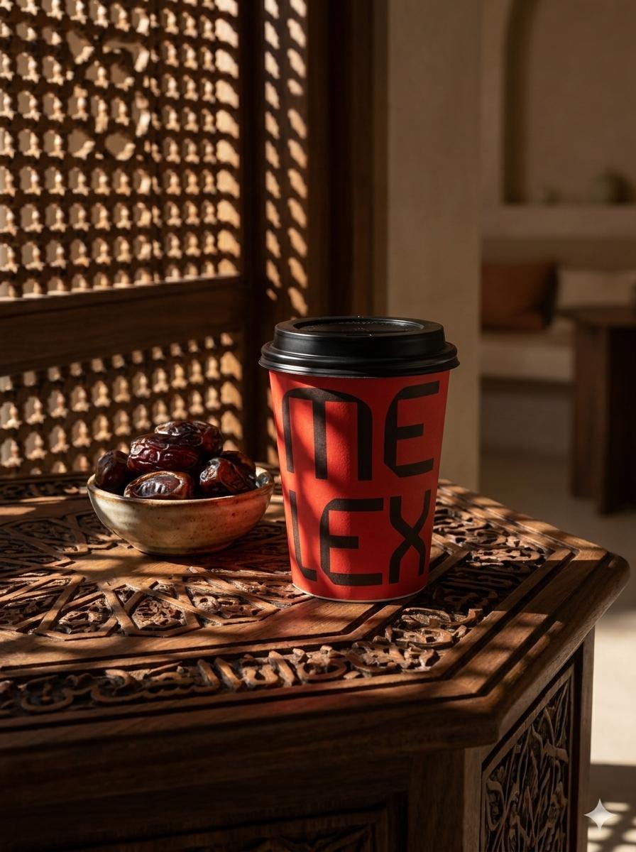
A digital identity and suite of collateral that carries the brand consistently across social, menu design, and marketing materials, meeting a digitally fluent Saudi audience where they already are.


The Outcome
Melex launched with a brand that does the hardest thing in the premium F&B space: it makes quality feel welcoming. The identity system positions the brand credibly in Saudi Arabia's fastest-growing coffee market — giving Melex the visual foundation to grow across cities and formats without outgrowing what it looks like.

Project Details
Services: Brand Identity · Brand Guidelines · Packaging · Digital · Collateral
Industry: Specialty Coffee · Food & Beverage · Hospitality
Location: Saudi Arabia — Riyadh · Jeddah · Dammam
Market: KSA Urban · GCC F&B