Modest Fashion Brand - Doha
Kikkō is a luxury modest fashion label based in Saudi Arabia, built around a single and genuinely distinctive product concept: the Kimono Abaya, a contemporary garment that blends the structural draped elegance of Japanese sartorial tradition with the cultural requirements and design sensibility of modern Saudi modest fashion. The brief was to build a luxury visual identity and brand ecosystem around an exceptionally refined typographic mark, and to position Kikkō as a serious fashion house rather than simply a garment category. Mike Rock Studio delivered the brand identity, art direction, and packaging system for a label entering one of the most rapidly evolving luxury fashion markets in the region.
The Challenge:
Saudi Arabia's luxury modest fashion sector is in genuine creative transformation. Modern Saudi women are looking for garments that honour traditional modesty frameworks while expressing contemporary global design fluency, fluid silhouettes, and structural sophistication. The market is moving fast and the standard is rising. For a new label entering the high-end Kimono Abaya space, the challenge was not the product the concept was clear and compelling but the visual authority required to sit alongside international fashion houses rather than domestic garment makers.
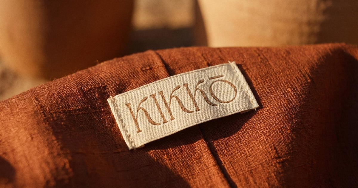
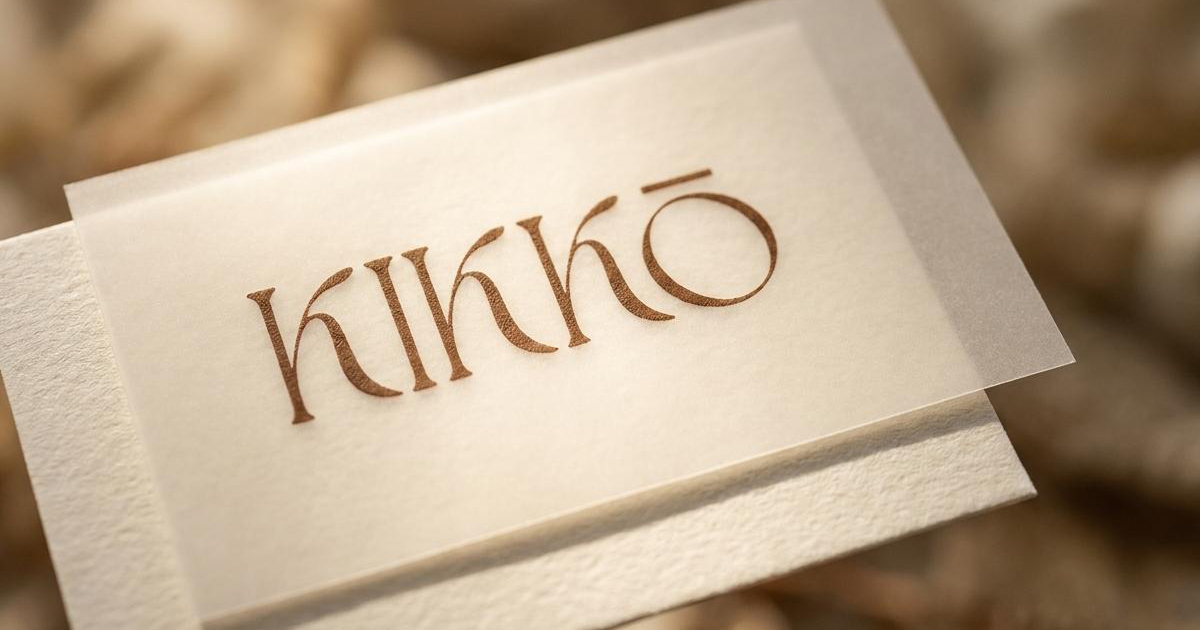
The existing creative asset was the Kikkō wordmark itself: a bespoke serif with sweeping fluid calligraphic ligatures and an integrated macron accent over the final Ō. The letterforms move the way the garment moves, the flowing lines of a kimono's drape translated into typographic form. The challenge was building a complete brand system around that mark: a packaging system that matched its quality, a digital presence that carried its restraint, and a positioning strategy that communicated the genuine cultural intelligence behind the Kimono Abaya concept to a design-literate Saudi audience.
The Approach:
The creative strategy positioned Kikkō at the intersection of Japanese architectural minimalism and Middle Eastern textile heritage. Not as a marketing claim but as a structural principle: the visual system was built the way the garment is built, from the inside out, with every element in deliberate relationship to every other.
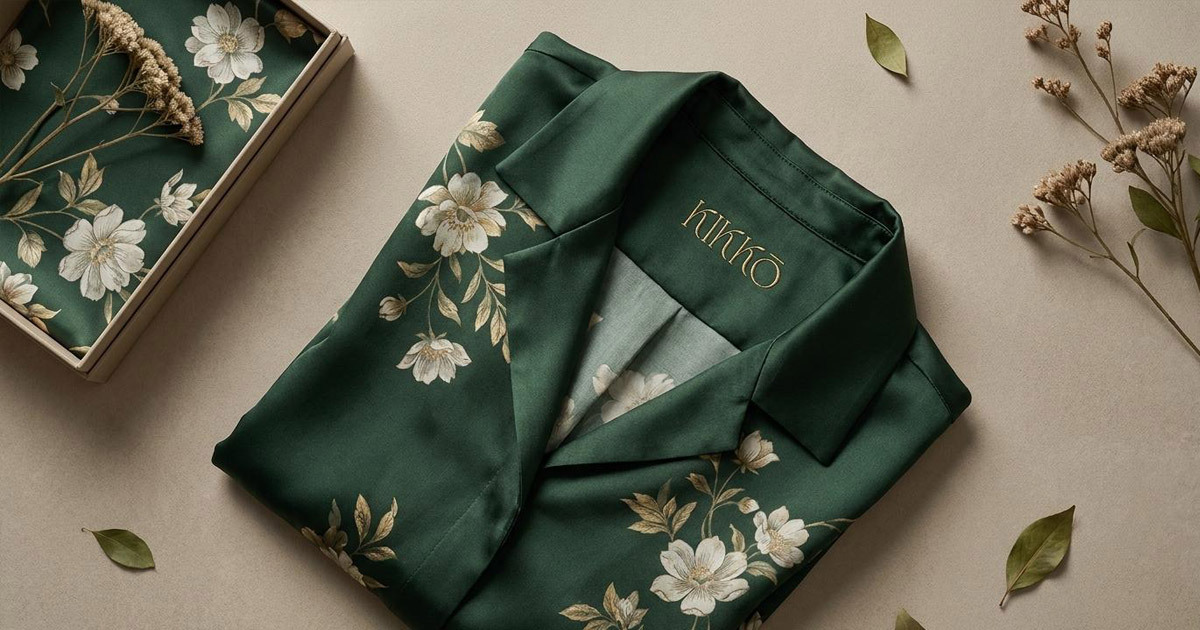
The palette draws from the natural materials at the core of Kikkō's collections: warm taupe tones that reference raw silks, premium linens, and heavy crepes rather than the cooler neutrals that dominate much of the contemporary modest fashion category. The typographic framework gives the custom wordmark the space it needs, generous breathing room and editorial grid structures that let the calligraphic detail of the letterforms do their work without competition.
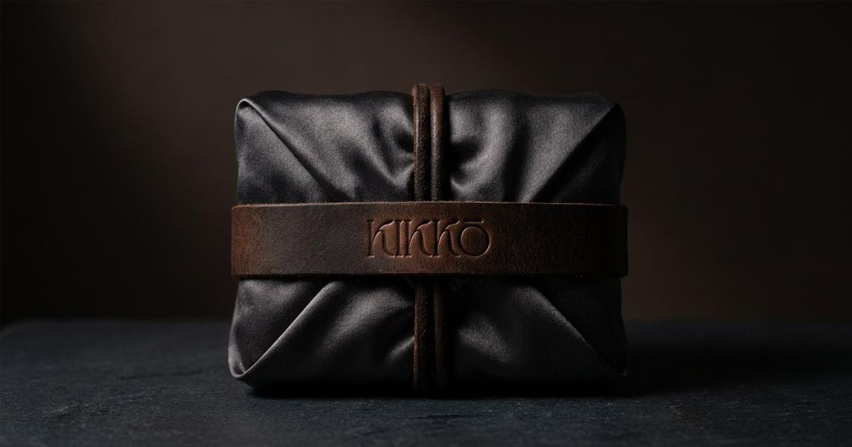
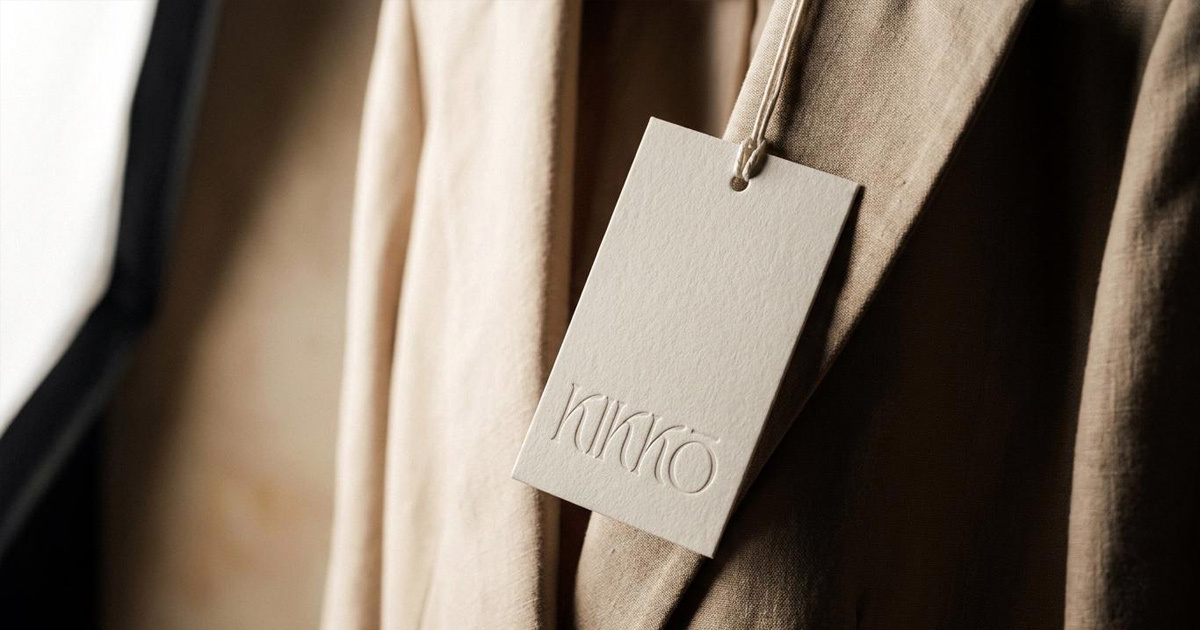
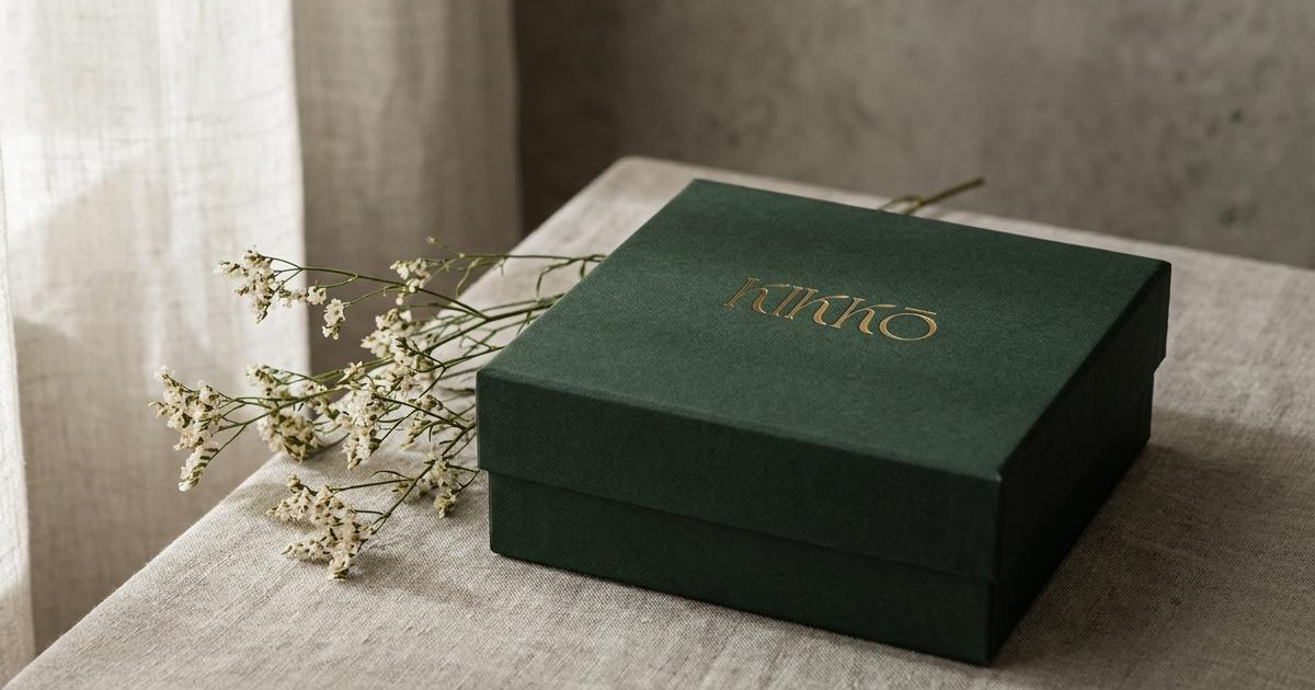
The packaging system was developed with the same structural logic as the origami tradition that runs through Japanese design: box folds that mirror paper-folding techniques, textured uncoated stocks, blind-debossed branding, and premium matte-card product tags with metallic hot-stamped detail. The unboxing experience was treated as an extension of the garment experience, sensory, considered, and entirely coherent with what is inside. The digital interface follows the same principle: gallery-style layout, high-contrast editorial photography, fluid navigation that captures the movement of the Kimono Abaya on screen rather than simply displaying it.

The Work:
Brand Identity:
A complete visual identity for Kikkō built around the bespoke typographic wordmark, a warm taupe and organic palette, and a brand architecture suited to the premium GCC luxury fashion market.
Art Direction & Packaging:
A packaging system that treats every physical touchpoint as part of the garment experience: structural rigid garment boxes with custom closure bands, blind-debossed tissue wraps, heavyweight linen shopping bags, and matte-card product tags with hot-stamped metallic detail.
The Outcome:
Kikkō launched with a brand identity that reflects the genuine cultural and sartorial intelligence behind the Kimono Abaya concept. The fluid wordmark, the considered palette, and the packaging system give the label a visual coherence that communicates fashion house authority without borrowing it from anywhere else. A Saudi luxury modest fashion label that looks as considered as the garment it is built around.
The perfect synthesis of draped tradition and contemporary structural elegance.
Project Details:
Services: Brand Identity, Logomark, Art Direction, Packaging, Fashion Positioning
Industry: Luxury Fashion, Modest Apparel, Creative Direction
Location: Saudi Arabia
Market: Saudi Luxury Fashion, GCC Modest Wear, Riyadh and Jeddah Premium Retail