Wine Club Brand Identity France
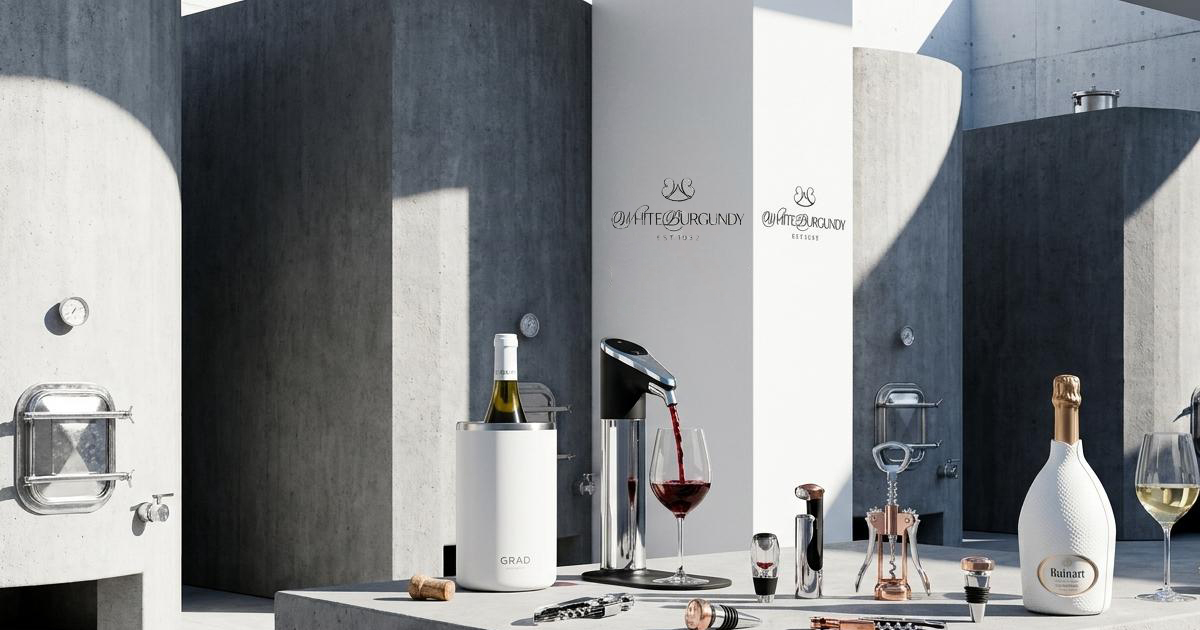
White Burgundy is an ultra-niche private enthusiasts' club built entirely around the appreciation of white Burgundy wines. Not a retail membership, not a tasting subscription, not a wine club in any conventional sense: a curated private association for younger, design-literate connoisseurs who find the traditional wine appreciation world too formal, too commercial, and too eager to impress. Mike Rock Studio built the brand identity and guidelines for a club that needed to feel effortlessly cool, unapologetically selective, and entirely unbothered by anyone who doesn't already understand the reference.
The Challenge:
Traditional wine culture has a visual problem. Heritage crests, antique typefaces, formal ceremony, the whole apparatus signals knowledge but rarely signals taste in the contemporary sense of the word. For a club whose audience actively rejects that register, the challenge was building a wine brand that didn't look like a wine brand, while still communicating the genuine depth of connoisseurship behind it.
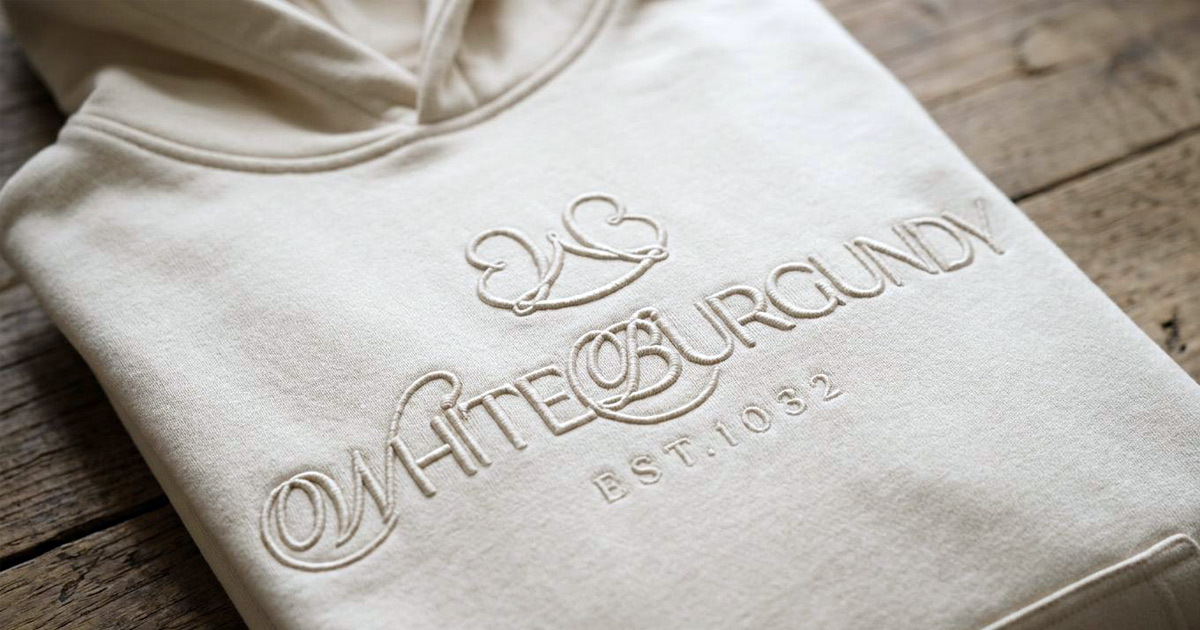
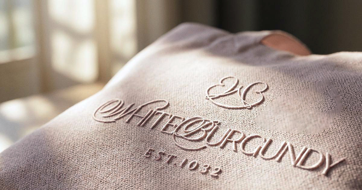
The brief contained the clearest possible creative direction: if White Burgundy were a person, she would be a stylish young French woman who doesn't care about pleasing anyone, magnetic precisely because of her quiet uninterest. The visual system had to carry that exact quality. The mark also had a specific technical constraint: it needed to work as white-on-white puff embroidery on premium apparel, remaining effectively invisible to outsiders while reading clearly to those who know. A silent handshake rather than a badge.
The Approach
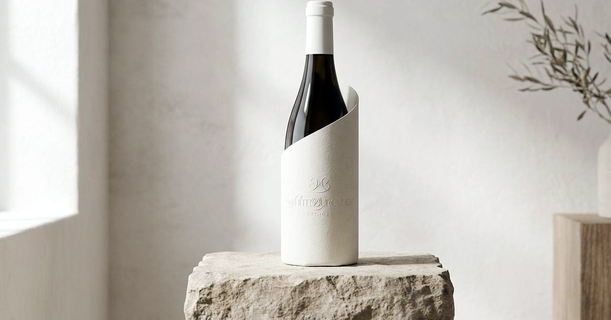
The logomark is built from a continuous ribbon script, looping the W and B into an interlocking abstract monogram that references the looping script of historical French cellars while reading as entirely contemporary. The movement of the form carries the same quality as the wine it represents: fluid, considered, with a depth that reveals itself gradually rather than announcing itself immediately.
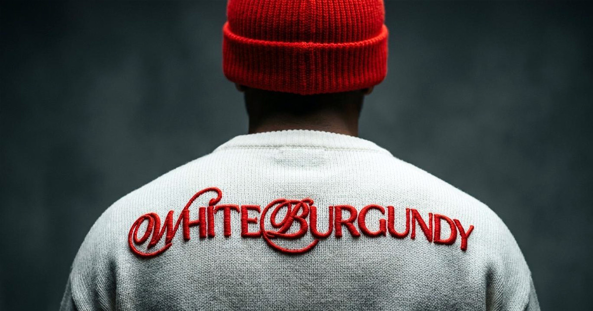
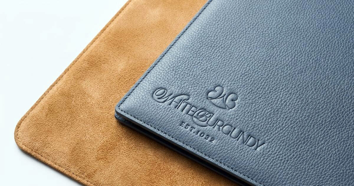
The wordmark sets WHITE BURGUNDY in a custom, clean high-contrast serif with exaggerated ligatures, paired with an EST. 1032 sub-text that grounds the club's historical seriousness without making it the dominant message. The typographic balance between the ornamental script monogram and the architectural serif wordmark mirrors the club's own balance between French romanticism and modern restraint.
The colour strategy is absolute: white-on-white and black-on-white only. The palette evokes the pale golden clarity of a grand cru Chardonnay in a minimalist setting without illustrating it literally. For the apparel applications, the monogram was engineered for high-density puff embroidery, creating a raised, tactile texture that relies on light and shadow rather than colour contrast. The mark is present without being visible, which is exactly the register the club operates in.
The Work:
Brand Identity:
A complete visual identity for White Burgundy: the continuous ribbon WB monogram, custom-spaced serif wordmark, and a disciplined monochromatic brand architecture built for an exclusive, design-literate private club.
Brand Guidelines:
A guidelines document covering every application of the White Burgundy identity, including technical specifications for the white-on-white puff embroidery applications that are central to how the club's members carry the brand.


The Outcome:
White Burgundy has a brand identity that matches the posture of the club itself: quiet, confident, and entirely uninterested in explaining itself to anyone outside its circle. The monogram and the monochromatic discipline give the brand a presence that is immediately recognisable to its audience and entirely invisible to everyone else, which is, for a club of this kind, exactly the right measure of success.
Aloof, magnetic, and completely uninterested in matching anyone else's standards.

Project Details:
Services: Brand Identity, Logomark, Brand Guidelines
Industry: Private Enthusiast Club, Luxury Lifestyle, Connoisseur Culture
Location: France
Market: European Wine Connoisseurs, Luxury Lifestyle, Private Club Membership